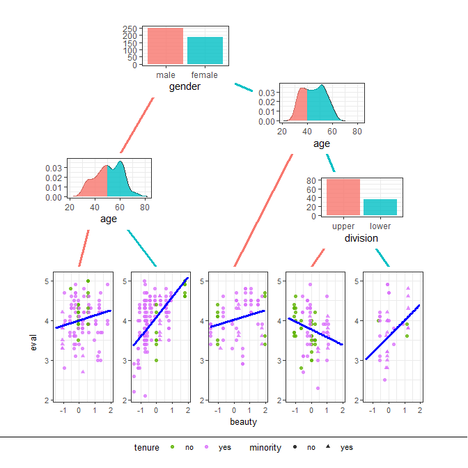
-
Notifications
You must be signed in to change notification settings - Fork 14
1 Motivating Example
Martin edited this page Jun 28, 2019
·
3 revisions

library(ggparty)

data("TeachingRatings", package = "AER")
tr <- subset(TeachingRatings, credits == "more")

tr_tree <- lmtree(eval ~ beauty | minority + age + gender + division + native +
                    tenure, data = tr, weights = students, caseweights = FALSE)

# create dataframe with ids, densities and breaks
# since we are going to supply the data.frame directly to a geom inside gglist,
# we don't need to worry about the number of observations per id and only data for the ids
# used by the respective geom_node_plot() needs to be generated (2 and 5 in this case)
dens_df <- data.frame(x_dens = numeric(), y_dens = numeric(), id = numeric(), breaks = character())
for (id in c(2, 5)) {
  x_dens <- density(tr_tree[id]$data$age)$x
  y_dens <- density(tr_tree[id]$data$age)$y
  breaks <- rep("left", length(x_dens))
  if (id == 2) breaks[x_dens > 50] <- "right"
  if (id == 5) breaks[x_dens > 40] <- "right"
  dens_df <- rbind(dens_df, data.frame(x_dens, y_dens, id, breaks))
  }

# adjust layout so that each node plot has enough space
ggparty(tr_tree, terminal_space = 0.4,
        layout = data.frame(id = c(1, 2, 5, 7),
                            x = c(0.35, 0.15, 0.7, 0.8),
                            y = c(0.95, 0.6, 0.8, 0.55))) +
  # map color of edges to birth_order (order from left to right)
  geom_edge(aes(col = factor(birth_order)),
            size = 1.2,
            alpha = 1,
            # exclude root so it doesn't count as it's own colour
            ids = -1) +
  # density plots for age splits
  geom_node_plot(ids = c(2, 5),
                 gglist = list( # supply dens_df and plot line
                   geom_line(data = dens_df,
                             aes(x = x_dens,
                                 y = y_dens),
                             show.legend = FALSE,
                             alpha = 0.8),
                   # supply dens_df and plot ribbon, map color to breaks
                   geom_ribbon(data = dens_df,
                               aes(x = x_dens,
                                   ymin = 0,
                                   ymax = y_dens,
                                   fill = breaks),
                               show.legend = FALSE,
                               alpha = 0.8),
                   xlab("age"),
                   theme_bw(),
                   theme(axis.title.y = element_blank())),
                 size = 1.5,
                 height = 0.5
  ) +
  # plot bar plot of gender at root
  geom_node_plot(ids = 1,
                 gglist = list(geom_bar(aes(x = gender, fill = gender),
                                                   show.legend = FALSE,
                                                   alpha = .8),
                               theme_bw(),
                               theme(axis.title.y = element_blank())),
                 size = 1.5,
                 height = 0.5
  ) +
  # plot bar plot of division for node 7
  geom_node_plot(ids = 7,
                 gglist = list(geom_bar(aes(x = division, fill = division),
                                        show.legend = FALSE,
                                        alpha = .8),
                               theme_bw(),
                               theme(axis.title.y = element_blank())),
                 size = 1.5,
                 height = 0.5
  ) +
  # plot terminal nodes with predictions
  geom_node_plot(gglist = list(geom_point(aes(x = beauty,
                                              y = eval,
                                              col = tenure,
                                              shape = minority),
                                          alpha = 0.8),
                               theme_bw(base_size = 10),
                               scale_color_discrete(h.start = 100)),
                 shared_axis_labels = TRUE,
                 legend_separator = TRUE,
                 predict = "beauty",
                 predict_gpar = list(col = "blue",
                                    size = 1.1)) +
  # remove all legends from top level since self explanatory
  theme(legend.position = "none")