-
Notifications
You must be signed in to change notification settings - Fork 28
How To Use
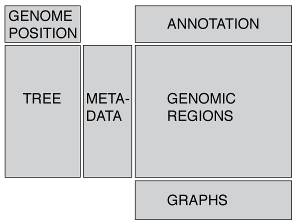
Phandango is designed around displaying a phylogeny (tree) linked to metadata and/or genomic data such as recombination blocks or pan-genome content. These files are displayed in the app when the appropriate files are dragged onto the browser (or one of the examples is loaded from the app). Note that in nearly all cases a tree is essential!

The layout is designed to be flexible and display whatever data you provide (trees, metadata, genomic data - see below). We have attempted to display warnings for inappropriate combinations of data-types, for instance trying to display metadata without a phylogeny. If you would like to visualise geographical data, such as GPS co-ordinates then you may want to take a look at microreact.
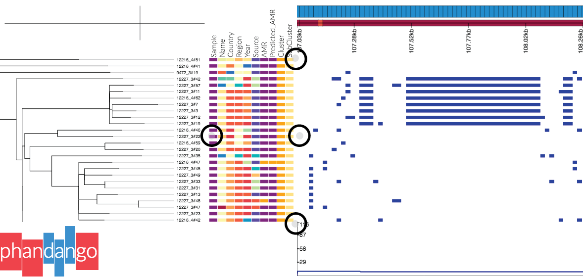
Panels can be resized by dragging the small grey circles at the edge of panels, as shown in this screenshot:
 Alternatively one can change the panel sizes in the settings menu (accessed by pressing
 s or clicking the link at the top of the screen). Note: if the tree disappears, try right clicking in the tree panel and selecting redraw original tree.
- You may zoom with a trackpad / mouse wheel, and by holding
controlorcommandyou can zoom the tree in the horizontal direction only - Drag the tree to move it
- Right clicking brings up some general display options
- Right clicking on a node allows you to redraw the subtree
Note: the tree is drawn using the phylocanvas library, developed at the [CGPS] (http://www.sanger.ac.uk/science/collaboration/centre-global-pathogen-surveillance-cgps).
- Metadata appears as coloured blocks in line with the associated taxa in the tree (so a tree is essential).
- Hovering over blocks shows you the data for each block
- Pressing
ktoggles a key - In the settings menu (see link in header or press
s) you may toggle columns on or off. - You can group columns (so that the same values in different columns have the same colour) as well as providing your own colours (see Input data formats#metadata for details on how to format these files).

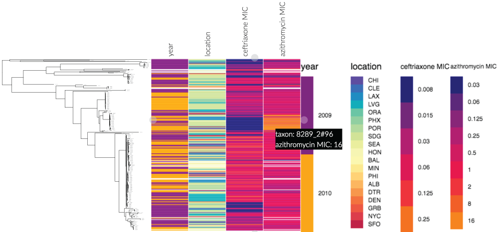
This screenshot (of an example dataset from phandango.net), shows the power of displaying metadata next to a phylogeny - a ceftriaxone susceptible, but azithromycin resistant subclade is immediately identifiable. Data taken from Grad et al., Lancet Indec Dis 2014.

- The genome annotation panel shows the linerised genome, with genes displayed as rectangles - hover over these to display the available information.
- If the data is from a pan-genome analysis (Left Hand Side of screenshot), the contigs and genes are inferred from the pan-genome content and, as such, the ordering may not be related to the genome order.
- If the annotation is provided from a gff (Right Hand Side) then colours are taken from the gff (if provided). Currently colours must be specified as integers in the info/attribute column (column 9) of the gff file following the format "colour=int" or "color=int" using the colour designations defined for Artemis:
| Integer | Colour | RGB equivalent |
|---|---|---|
| 0 | white | 255 255 255 |
| 1 | dark grey | 100 100 100 |
| 2 | red | 255 0 0 |
| 3 | green | 0 255 0 |
| 4 | blue | 0 0 255 |
| 5 | cyan | 0 255 255 |
| 6 | magenta | 255 0 255 |
| 7 | yellow | 255 255 0 |
| 8 | pale green | 152 251 152 |
| 9 | light sky blue | 135 206 250 |
| 10 | orange | 255 165 0 |
| 11 | brown | 200 150 100 |
| 12 | pale pink | 255 200 200 |
| 13 | light grey | 170 170 170 |
| 14 | black | 0 0 0 |
| 15 | mid red | 255 63 63 |
| 16 | light red | 255 127 127 |
| 17 | pink | 255 191 191 |
Recombination regions are displayed as coloured blocks relative to the taxa involved (vertical axis) and the genomic region affected (horizontal axis).
- Because Gubbins provides some metadata with each block (number of SNPs e.t.c), hovering over Gubbins blocks displays this.
- Gubbins blocks are coloured red if they are ancestral, i.e. occurred at a non-terminal node, and blue if they only affect one isolate, i.e. happened at the leaf.
- BRAT NextGen provides the homeCluster information with blocks which can be used to infer which part of the tree was the donor. These are indicated as a column of metadata and contribute the colour of the blocks.
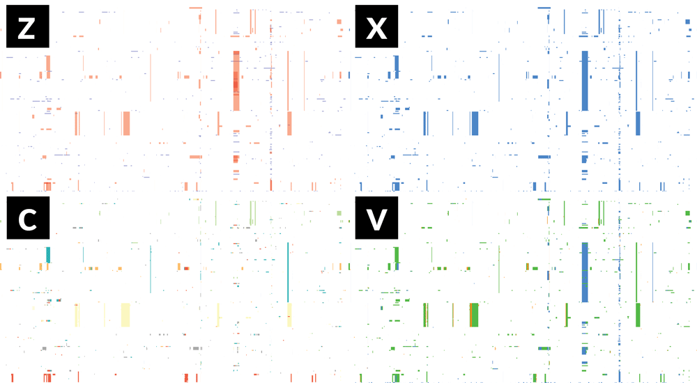
- If Gubbins and BratNextGen data are loaded, as in the PMEN1 example, you may toggle between the different datasets via the settings menu of the key shortcuts
z,x,candv, as shown in the following gif. This toggles between Gubbins (z); Gubbins Per Taxa, i.e. every event occurs at the leaf similar to BRAT NextGen (x); BRAT NextGen (c) and a merge (v). In the merge, Gubbins-only regions are blue, BRAT NextGen-only regions are orange and green indicates regions inferred by both algorithms.
Pan-genome content is displayed as presence / absence blocks relative to an ordering of genes and contigs which appear in the Genome Annotation panel. Hovering over each block shows you the individual gene name. Note that the ordering of the genes is specific to the input, and should not be thought of as a true genome annotation!
 The line graph displayed when genomic block data is loaded is flexible and aims to summarise the data in the above panel. * If recombination data is displayed, then a single filled in line (A, black) is shown which summarises the recombination profile over the loaded dataset.
- If you highlight a node (by selecting on the tree), then a second line (A, grey) appears which shows the recombination profile for the selected subclade.
- If both Gubbins & BRAT datasets are loaded, two lines appear (B) which show the differing recombination profiles inferred by each.
- For pan genome analysis, the filled in line (C, blue) shows the percentage of isolates carrying a gene at each position. When a sub-tree is selected, a second line appears (C, grey) showing the profile for that sub-tree (the percentage of isolates in the subtree).

- If GWAS results are loaded then they replace the line graph
- (A) shows GWAS results at a genome-wide level
- (B) by simply zooming into the boxed region in (A) we can easily correlate these variants with a genome annotation (not shown)
- The colour is determined by the
R^2value. - This example uses the available example dataset (Chewapreecha et al.) which combines an investigative dataset and a replication dataset. By giving each dataset a different
R^2value we may give each dataset a different colour.