Picture 1: Shows all of the scetches in a single photp

Picture 2: Show "Wigs and Portraits; The Glory Years"
 The goal here is to show the use of wigs in a creative timeline manner that also shows the scale of use. Wigs were at one time a sign of
wealth and prosperiety, and of social class. A fascinating look at the combination of fashion and class distinction. Spiral Plots like these are versatile way of showing showing fairly large data sets, usually to show trends over a large time period.
The data set is not very large, but large enough. About 140 points.
The goal here is to show the use of wigs in a creative timeline manner that also shows the scale of use. Wigs were at one time a sign of
wealth and prosperiety, and of social class. A fascinating look at the combination of fashion and class distinction. Spiral Plots like these are versatile way of showing showing fairly large data sets, usually to show trends over a large time period.
The data set is not very large, but large enough. About 140 points.
Picture 2: "Where do they all come from?" -working title
 The goal here is to visualize where the artifacts in the african art museum and asian art museum come from. The dataset is very large, with about 5000 datapoints,
and therefore could the visualization also work as a sort of heatmap of where the most artifacts come from. Time could also be a dimension.
The goal here is to visualize where the artifacts in the african art museum and asian art museum come from. The dataset is very large, with about 5000 datapoints,
and therefore could the visualization also work as a sort of heatmap of where the most artifacts come from. Time could also be a dimension.
Picture 3: "Relative Age Effect in Portraits"
 The goal here is to visualize where each subject of a portait was born in a calendar year. Relative age effect refers to the phenomenon by which children born early in their year of birth perform more highly than children born later in the year. The calendar could be interactive in a way, it could show information about the date when pressed or similar. Work in Progress!
You can also see the photos in the wiki page.
Design mockup and first prototype:
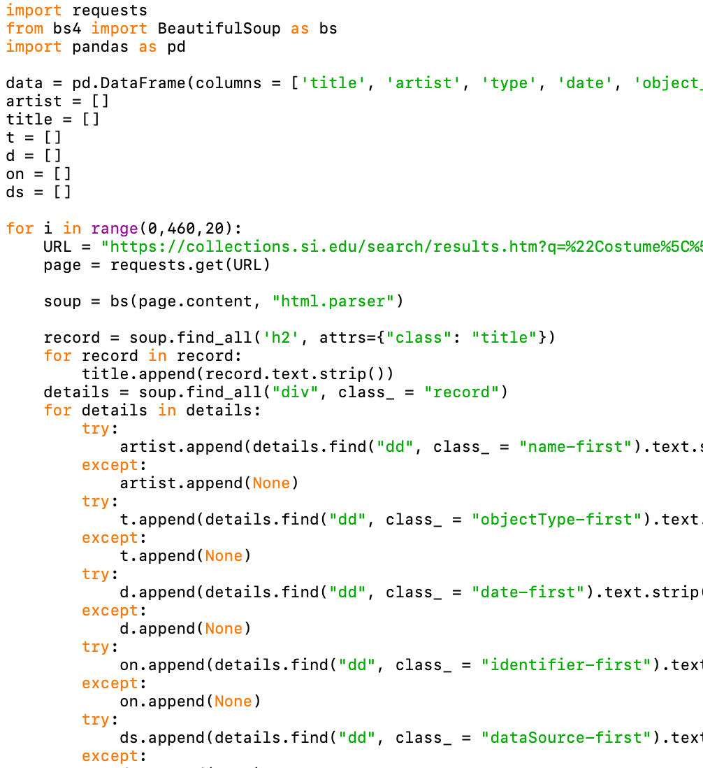
After settling on the spiral design as the project, I went to work with gathering the data. Quite quickly I noticed that the data avalaible in the API with CCO enabled media was very limited. The solution to that was to make data-sctipting script that simply extracts the data from the Smithsonian Collections Website. I used Python to make a simple scarping program, by using the packages BeautifulSoup and Panda, in the end the dataset was roughly 450 datapoints, after cleaning it up a bit a total of just under 400 points were usable.
While working on the script and getting it to work. I got to work on creating the spiral. With the help of numerous youtube videos and very helpful visualizations from https://www.d3-graph-gallery.com/. I realized after rading about d3.radialLine that there are two steps: Creating the circualar line and then adding the bars (http://using-d3js.com/05_03_radial_lines.html).
After using radialLine The visualization had become to:

Now all that is needed is actually placing the bars on the spiral, no biggie right?