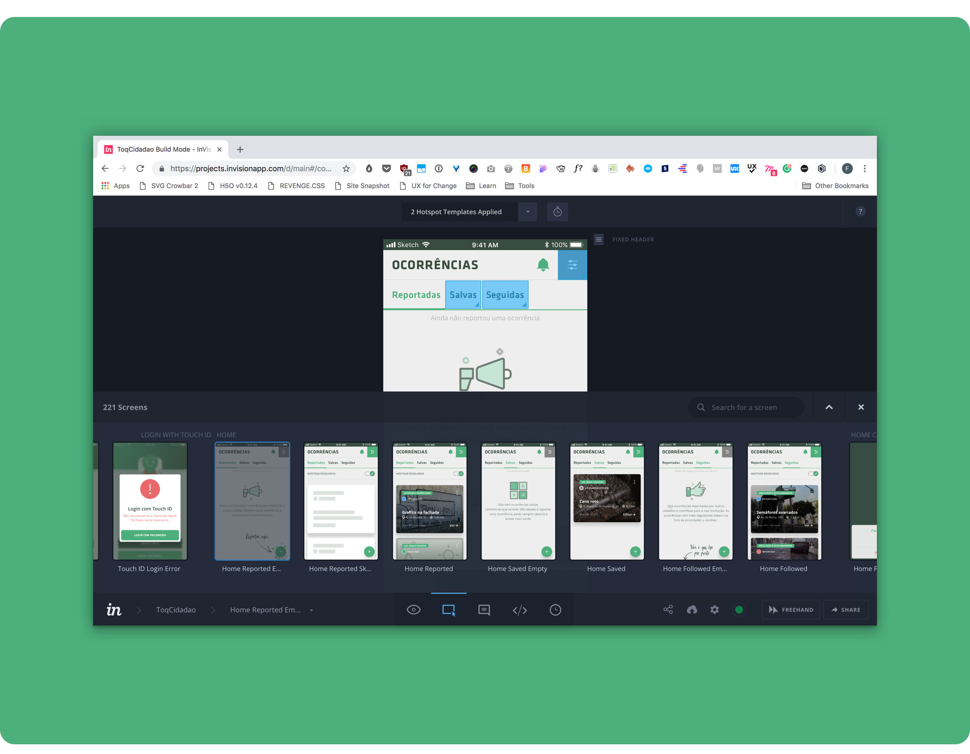
 Some Toqcidadão Screens. From left to right: Entry Screen, Part of the Onboarding, Home (showing the user’s reported issues), Report a new issue (first step).
📖 Estimated reading time: 12 minutes (2988 words)
Table of Contents
- Summary
- Problem
- Proposed Solution
- Step 1 — Research
- Step 2 — Storyboarding
- Step 3 — Proto-Persona
- Step 4 — User Flow
- Step 5 — Information Architecture
- Step 6 — Sketching and Wireframing
- Step 7 — Mockups
- Step 8 — Prototyping and Usability Testing
- Final Thoughts
Toqcidadão is a free mobile app that allows all citizens to report issues instantly, directly to local authorities or service providers.
Its main goal is to make citizens’ lives easier, by straight forwarding the communication of most issues found in their neighbourhood so they can be solved, hassle-free and in a timely manner, by the right authorities.
I developed this project with Juan de la Cruz, Marta Casal, Tiago Luís and Tiago Rodrigues for a User Experience Design class. The end goal of the project was delivering an MVP prototype of our idea and testing it with real users throughout the semester.
I took part in every design stage, from research to interaction design and testing, but was solely responsible for the final mockups and prototyping.
Our Vision
Foster the community spirit by making everybody responsible for solving issues in their neighbourhood;
Cultivate a sense of civic responsibility.
Our Mission
Offer an easier way for citizens to report most issues found outside in any city;
Improve the Portuguese public places.
👉 Check out Toqcidadão’s InVision Prototype here — https://filipago.github.io/toqcidadao-app-prototype/
People often have a hard time when trying to report issues they come across in their local community.
Not knowing which authority handles the specific issue, filling out long bureaucratic forms and not getting any feedback that the issue is being taken care of, can discourage even the most patient citizen from fulfilling its civic duties.
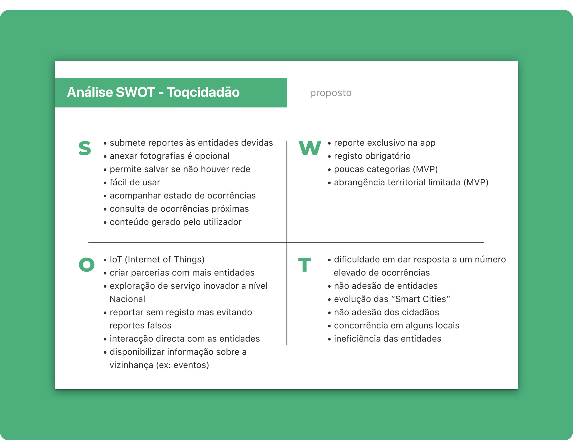
With Toqcidadão reporting an issue is as simple as taking a photo, filling in some details about the problem and sending the report with the issue’s location. The reported issue is automatically delivered to the appropriate authority in that area.
By categorizing issue types and handing them over to the relevant authority based on the incident’s location, reporting with Toqcidadão is quick, simple and hassle-free.
Toqcidadão is a straightforward, pain-free way of reporting local issues that gives citizens the satisfaction of contributing to getting problems fixed in their neighbourhood.
It’s also beneficial for authorities, councils and service providers, as it reduces the costs of large customer service units and call centres in urban management systems.
With Toqcidadão citizens can:
- Report an issue accurately, wherever they are;
- Automatically send the issue report to the right authority;
- Save a draft of the report if service is unavailable and send it later;
- Keep updated on their reports’ status;
- Check their past reports;
- View reported issues in the neighbourhood;
- Follow issues reported by other citizens;
- Comment and add photos to other citizen’s issues and their own;
- Setup a nickname to protect their identity from other citizens;
- Share issues on social media and email.
Toqcidadão lets citizens report a large number of issues like:
- Litter
- Street Cleaning
- Graffiti
- Roadblocks
- Abusive parking
- Pavement and road damage
- Broken street signs
- Broken playgrounds
- Street lighting issues
- Broken pipes
… And much more. We’ll expand the covered issues and improve categorization as we go.
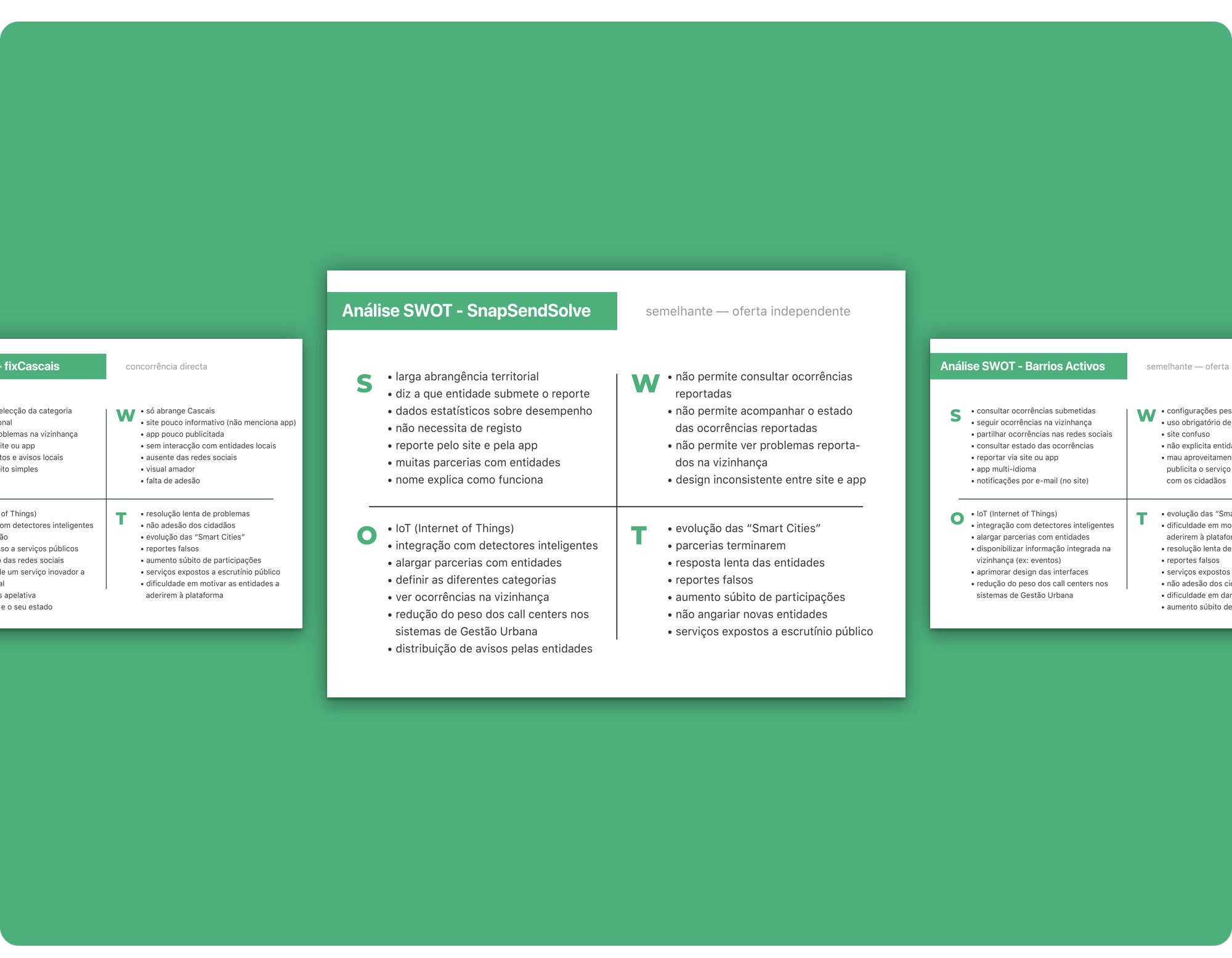
We kicked-off research by conducting a SWOT analysis on 3 competing products:
- FixCascais (Cascais/Portugal) — an app from the Cascais Municipal Council where each citizen, resident or visitor, can help the Chamber improve its territory, by reporting different issues that can be found in public spaces;
- Barrios Activos (Spain) — an online community (app and website) where neighbours can upload and support reports to wage solutions to the problems in their local area;
- Snap Send Solve (Australia and New Zealand) — an app that allows citizens to report issues to their council or local authorities.
Assessing the competition helped us understand these products’ pain-points and strengths, as well as explore new ideas, figure out how we can enter the market and find focus.
Doing a SWOT analysis helped us distil good ideas for features and ways of organizing our app that could work for our product design solution.
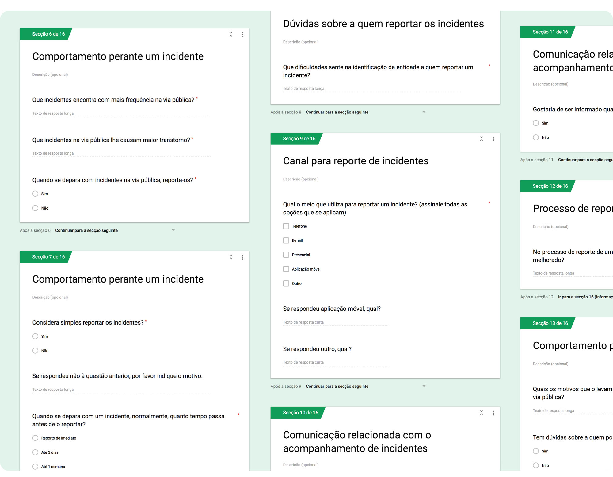
We did interviews and online surveys to assess:
- if our idea for this digital product could be useful;
- if people already report issues they find in public spaces;
- how they do it;
- what are the pain-points;
- what type of issues they report;
- what are the most common issues they find;
- if they don’t report, why;
- among other…
We worked on a set of questions that could help us reach our goals and sent out the survey via Google Forms.
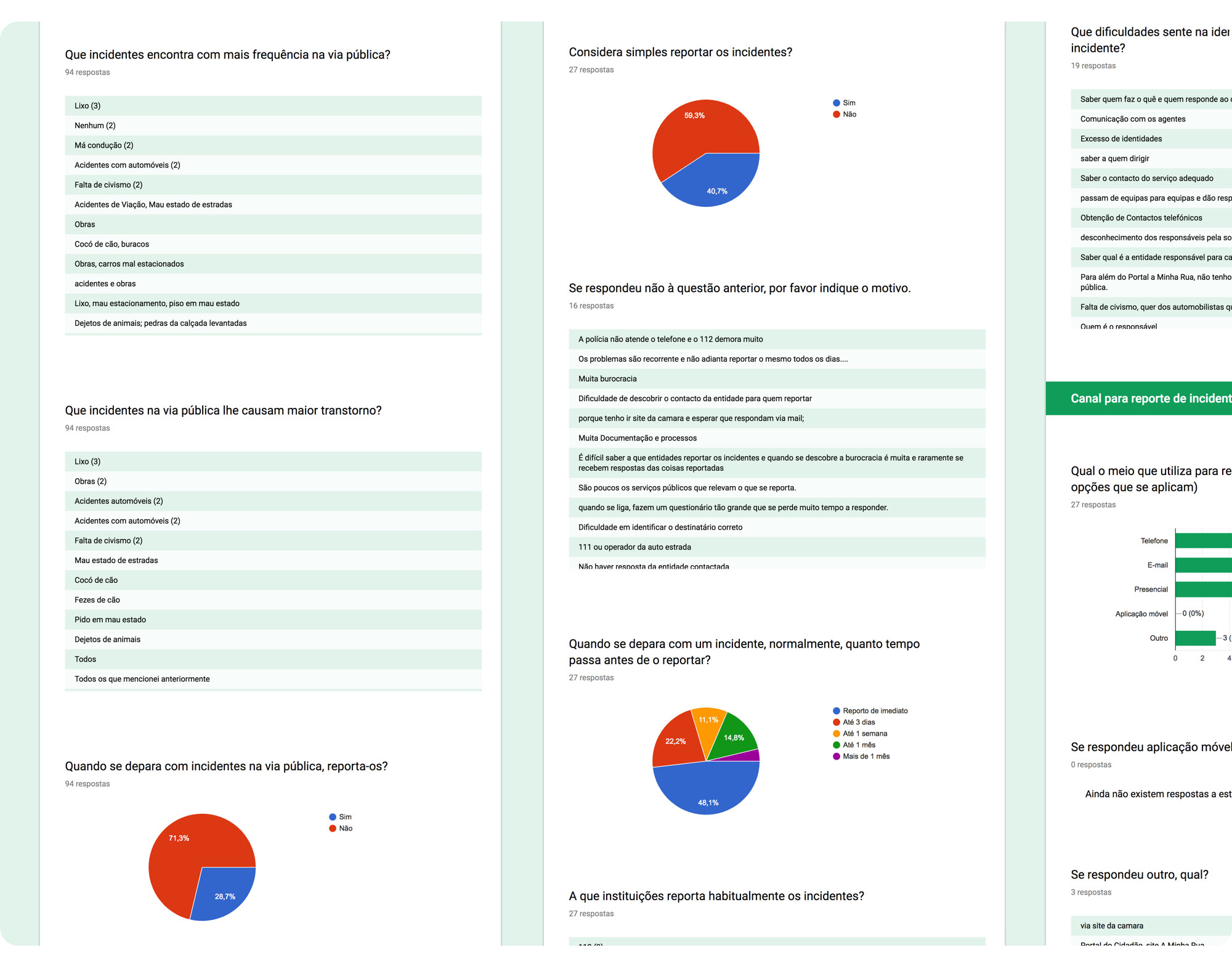
We distilled the most common answers from 90+ responses and followed-up with some target participants via in-person interviews.
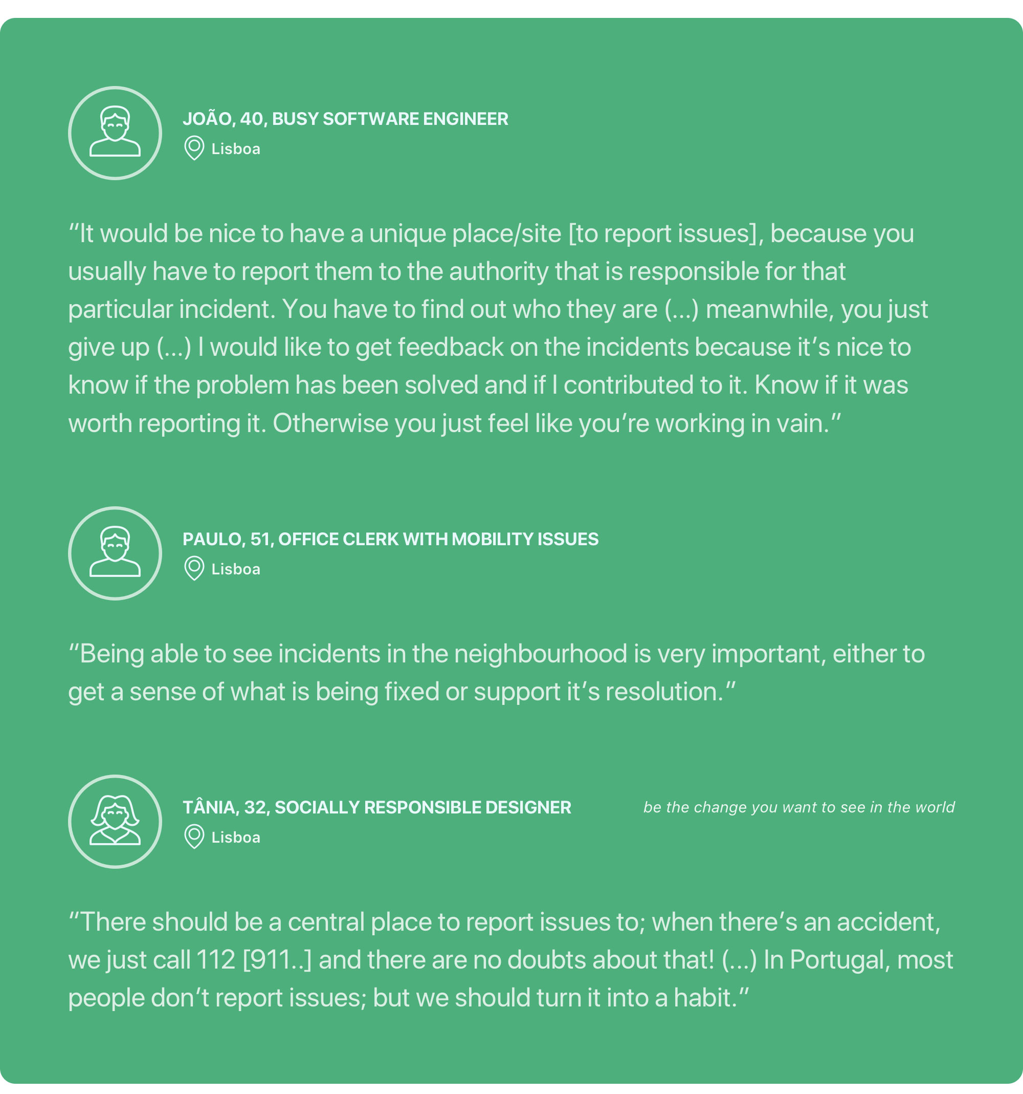
We discovered that 71% of our online participants don’t report incidents, mainly because they don’t know where to send the report (≈ 57%), the process is too long and tiresome, they never get feedback on the report and there’s no easy way to do it.
Less bureaucracy, ease and speed, as well as a way that could facilitate the report of several issues to various authorities could make these people start reporting.
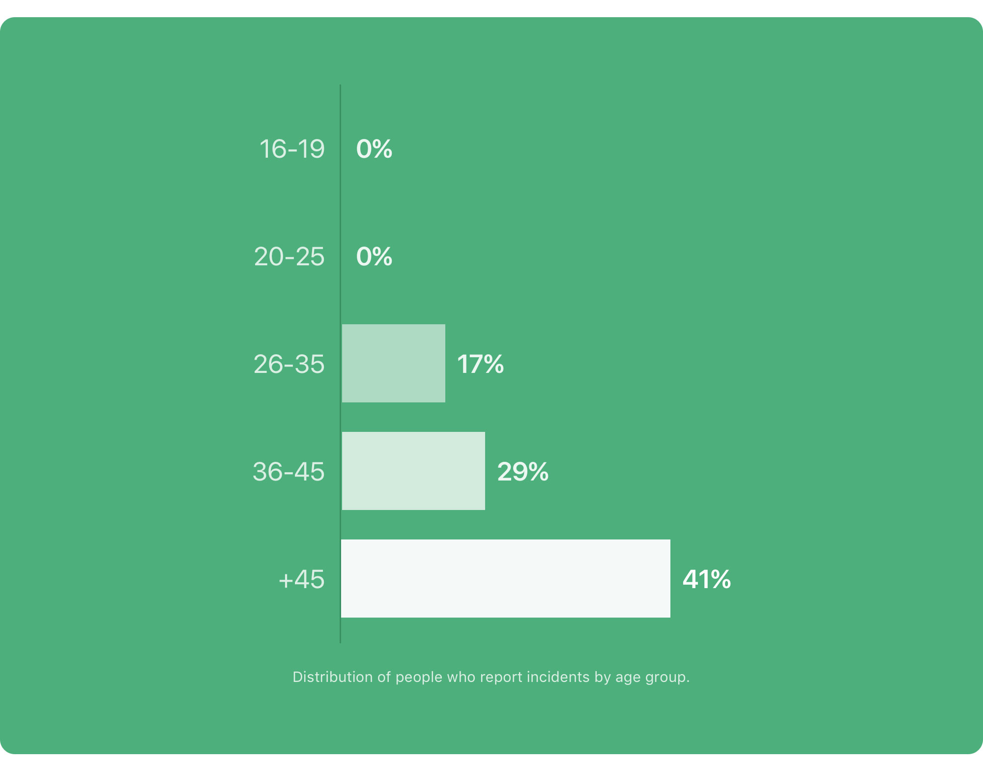 Most people who report incidents are over 45.
Those who already report incidents do it immediately, by email or phone, but more than half find it hard because knowing who’s the appropriate authority is tricky and the reporting process is over-complicated.
Getting feedback is also an issue. Approximately 82% of our inquirers that report incidents admitted that they never got feedback on any issue they reported, which can be frustrating. 96% believe feedback is very important so that they know they are making a difference.
The most common incidents people find on the street are litter, construction work, pavement damage, abusive parking and accessibility issues.
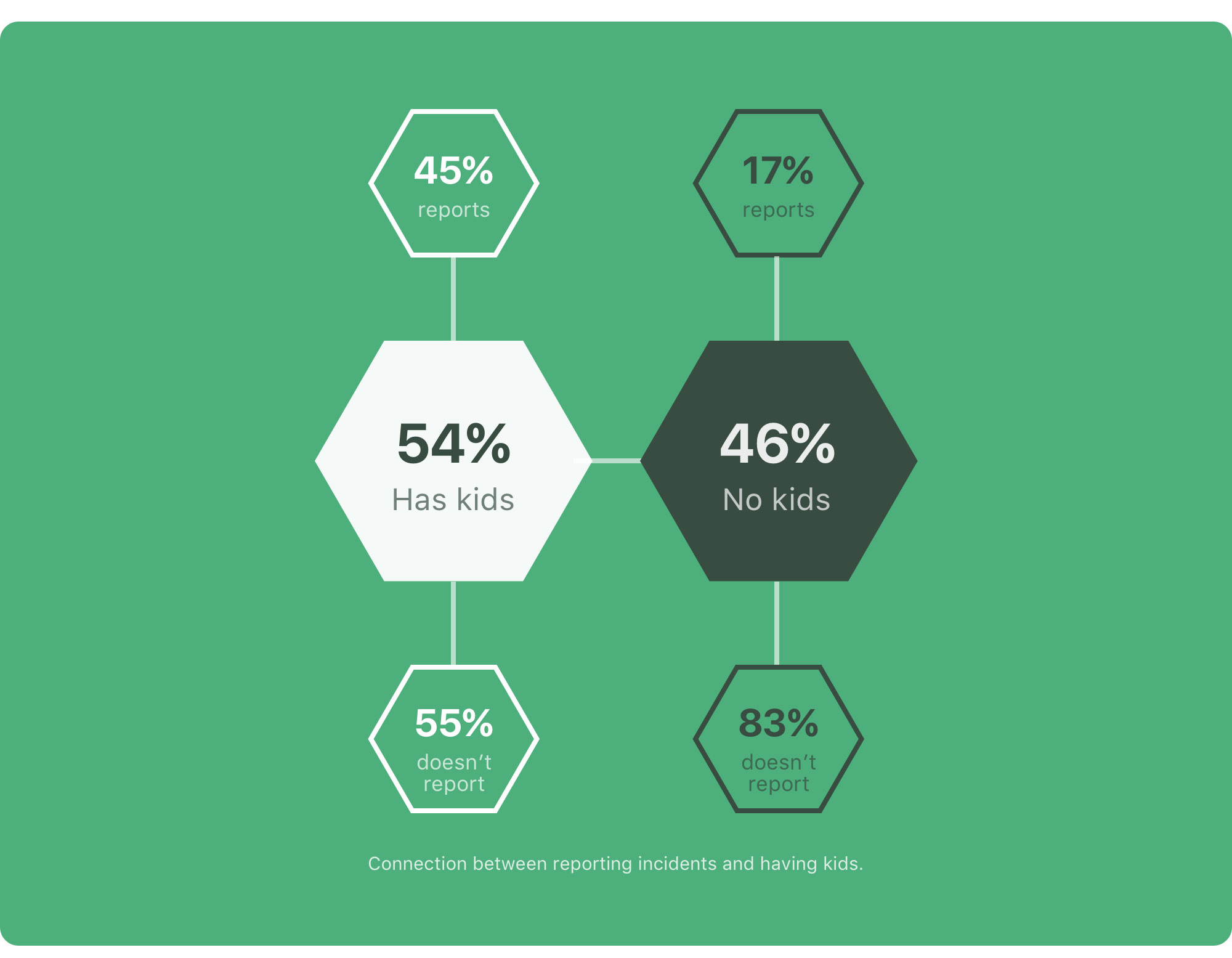 Apparently, people who have kids report issues more often than those who don’t.
There might also be a connection between having kids and reporting incidents. Maybe because people who have kids develop a sharper sense of civic duty as they’re taking care of something they’ll be leaving to their children.
The follow-up interviews ratified our survey insights. Most interviewees don’t know where to send their reports; they always have to look up online.
They said they’d be more proactive if there was a simpler way to report issues and that being able to check incidents in their surroundings, see if things are getting fixed and give their support would also make a big difference.
In fact, ≈ 92% of our online survey inquirers also said they’d like to know of issues reported nearby.
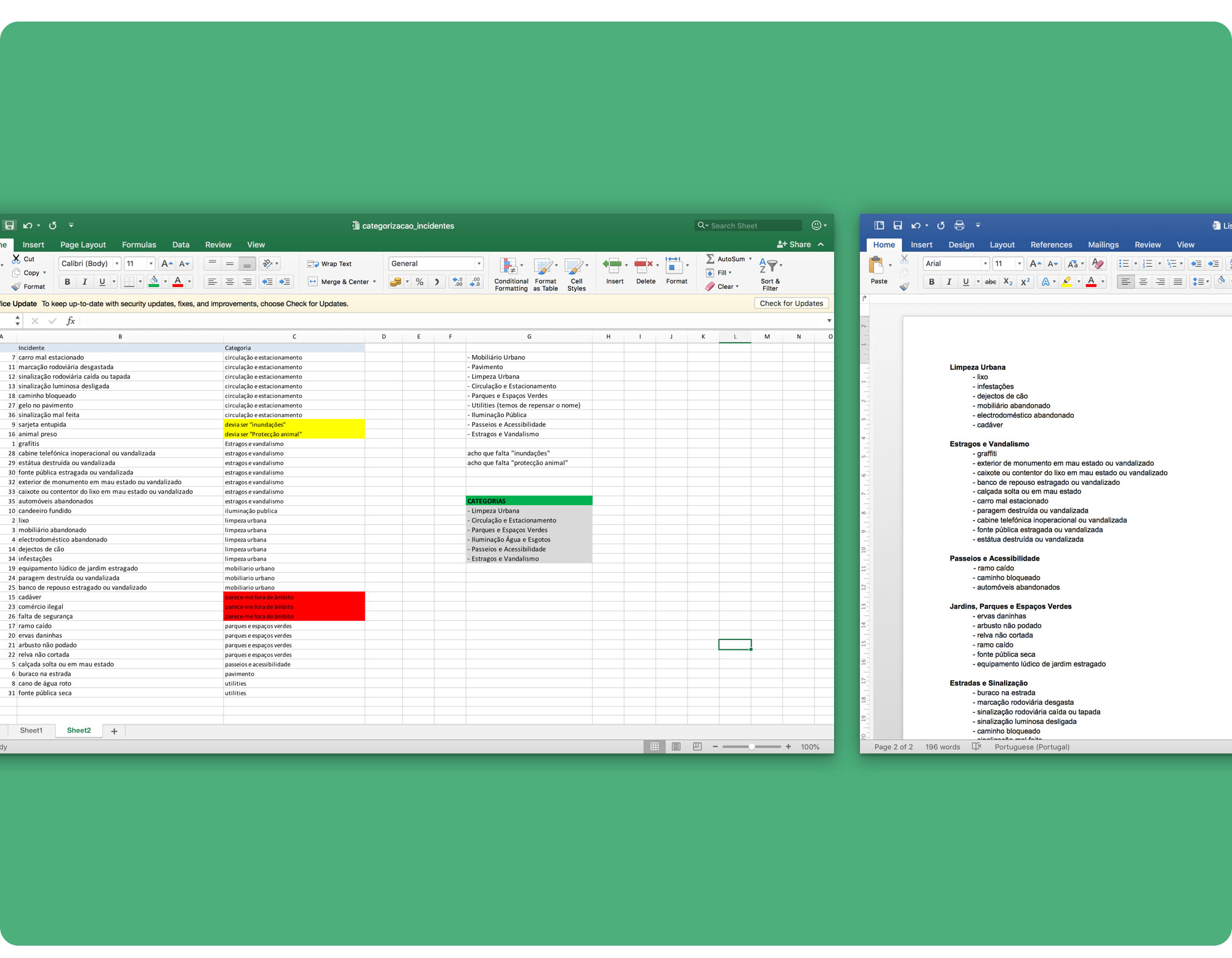
The interviews and online surveys also helped us categorize the incident types to include in the MVP.
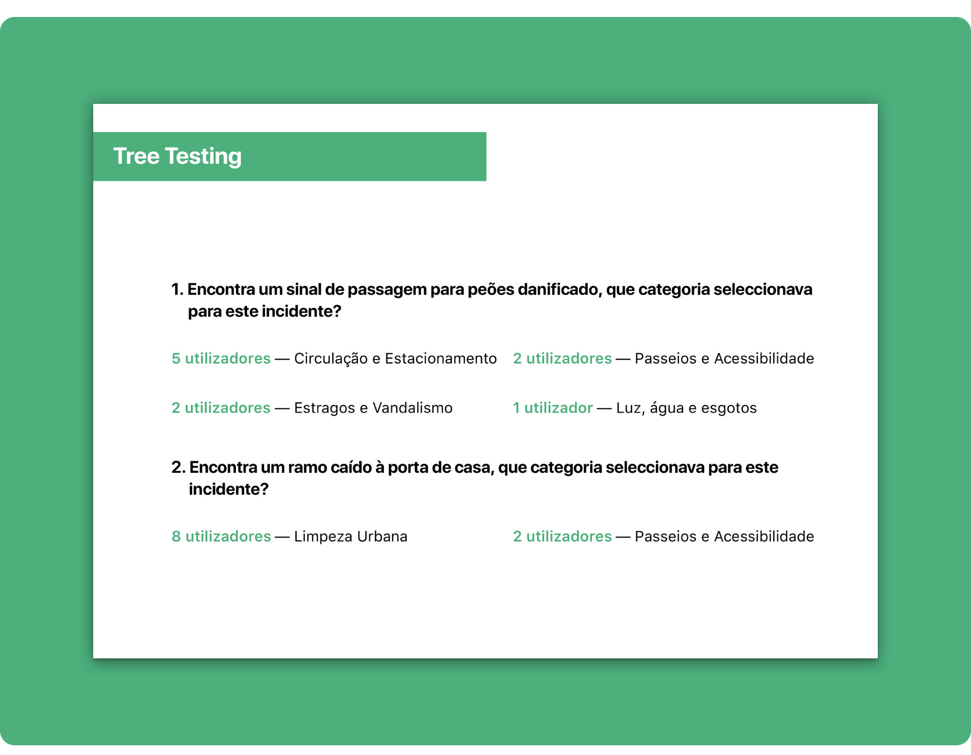
We did an “imaginary” list of incidents with every issue we could think of and individually tried to assign a category name to each one. We got to the category set by comparing results and making tests with 10 potential users using Optimal Workshop online tree testing.
The tree testing showed us that some incidents can be dubious and hard to categorize. So for the MVP, we decided that the categories screen should include a link to a help screen.
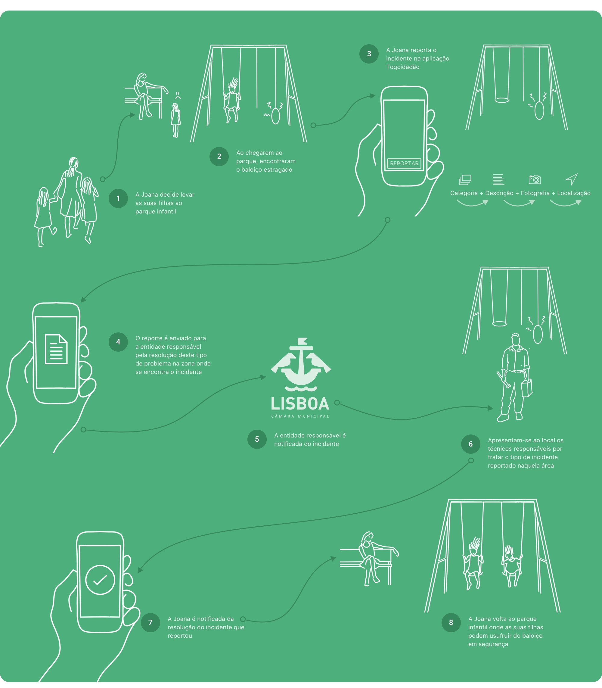 Storyboard depicting the user’s journey.
Joana, a mother of two, goes with her children to the playground. Her kids are sad because a swing is broken. Joana picks up her mobile phone and uses Toqcidadão to report the issue. She chooses a category for the incident, describes the problem, adds a photo, checks the location and hits send. The report is delivered to the relevant authority who sends technicians to repair the broken swing. Joana receives a notification when the issue is fixed and goes back to the park where her children can now play safely.
After analysing the results from the interviews and surveys, we storyboarded the user’s journey (scenario).
Our goal was to capture the problem and the solution instead of starting with the design of the screens.
This storyboard helped us ensure the whole team was on the same page about the problem our product solved.
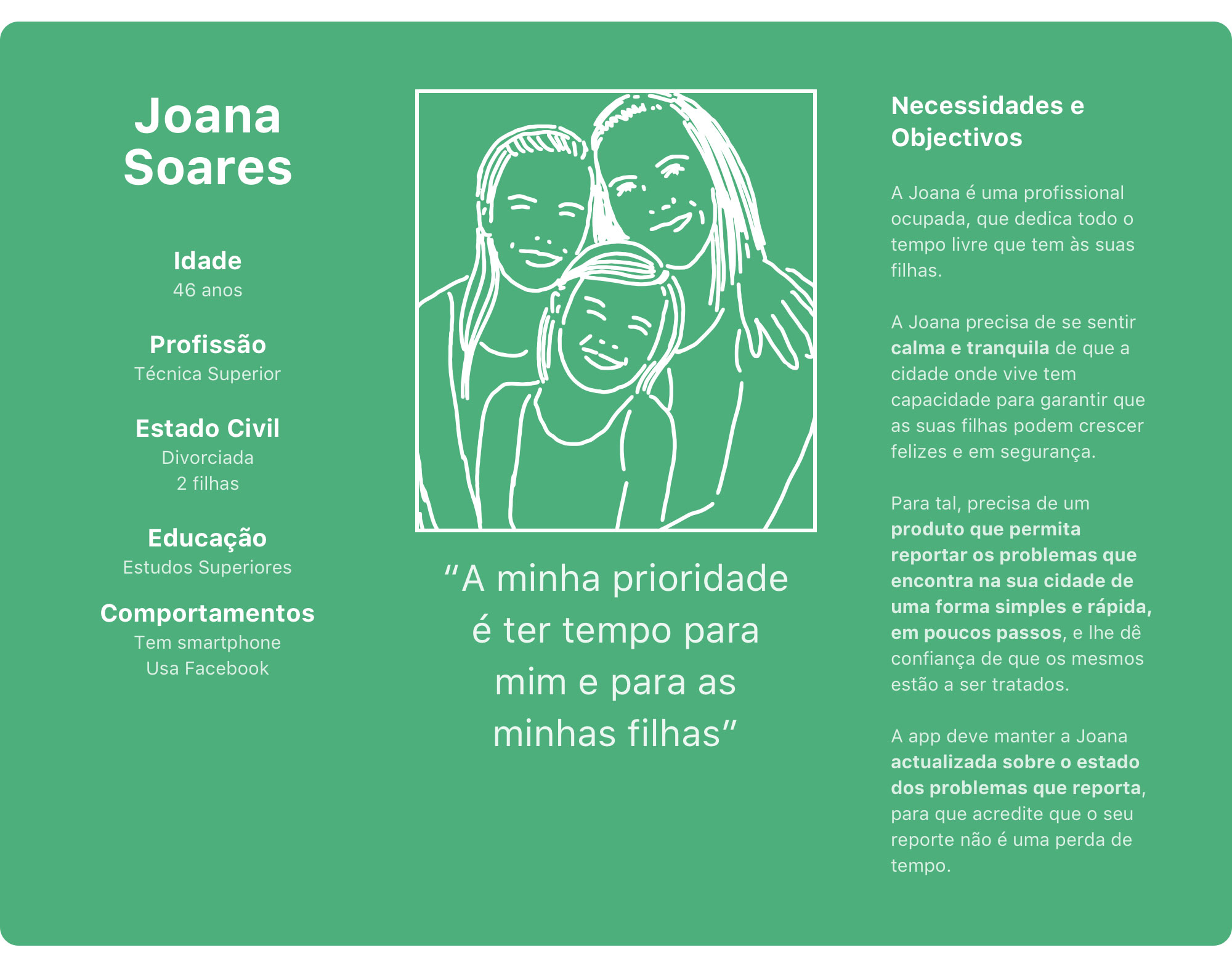 Meet Joana, our proto-persona.
The interviews, surveys and storyboard naturally allowed us to establish a key character to represent who will use the product. This way, we were able to design for a specific somebody instead of a generic anybody.
The proto-persona helped us foster empathy for the user and stay focused on people instead of features so we could design a solution that would solve specific problems for a precise type of user.
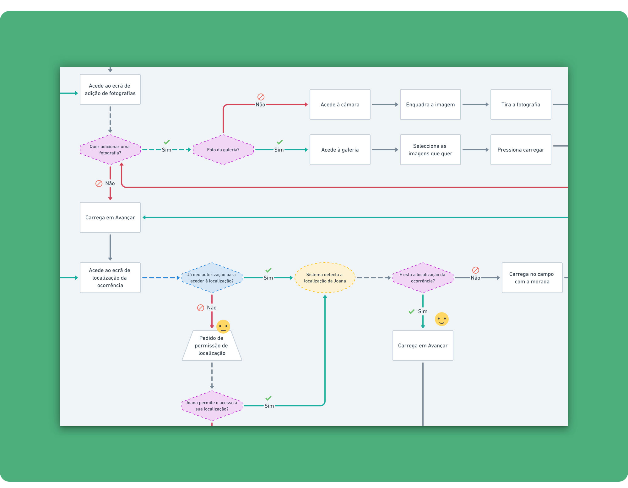
Mapping out the key user flow early helped us avoid spending too much time redesigning and revising wireframes.
The user flow also helped the team scope the product and understand the key tech dependencies.
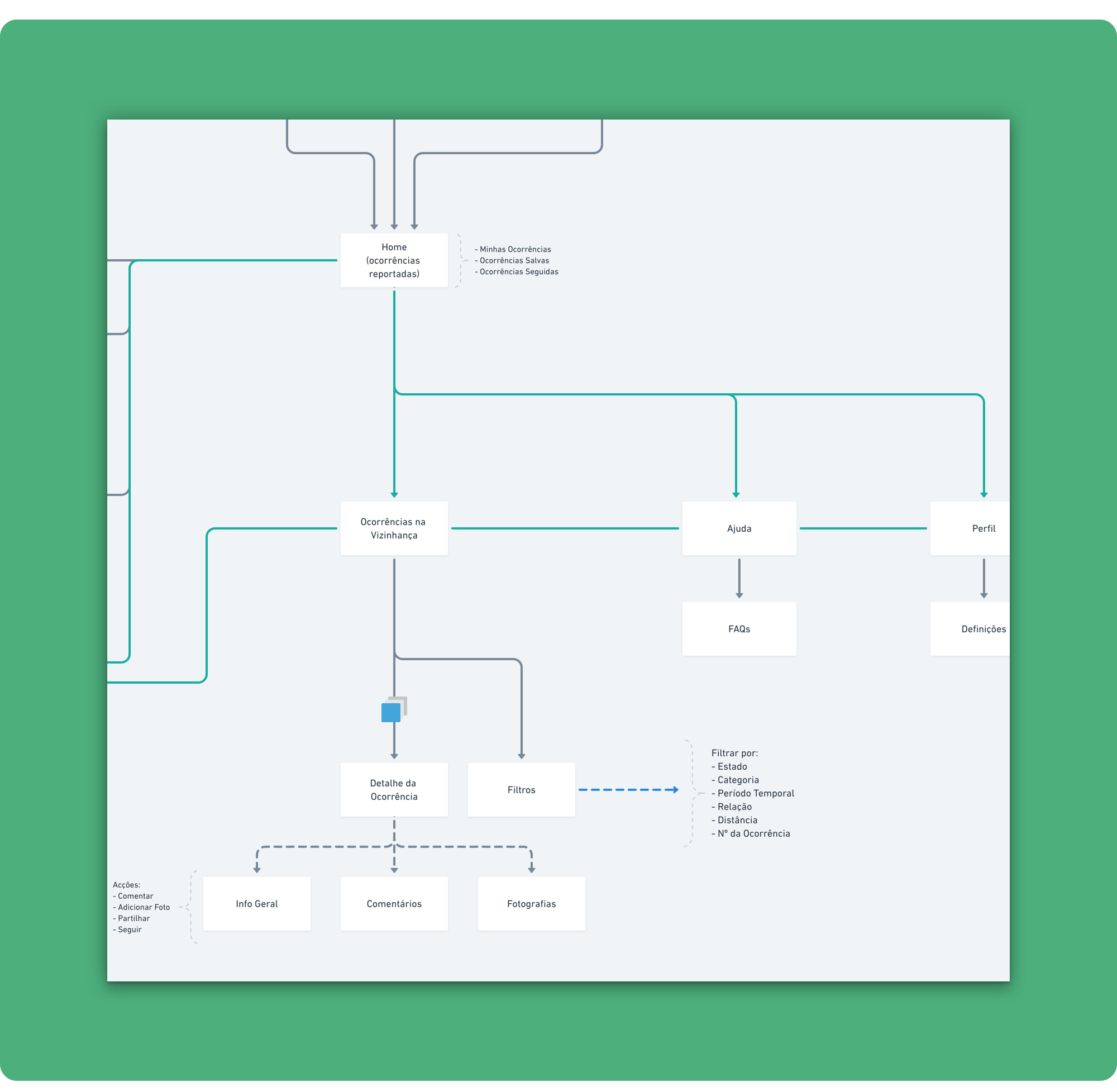 Information Architecture detail.
Before diving into the wireframes, we mapped out the high-level information architecture to make sure the whole team was on board about the app’s structure.
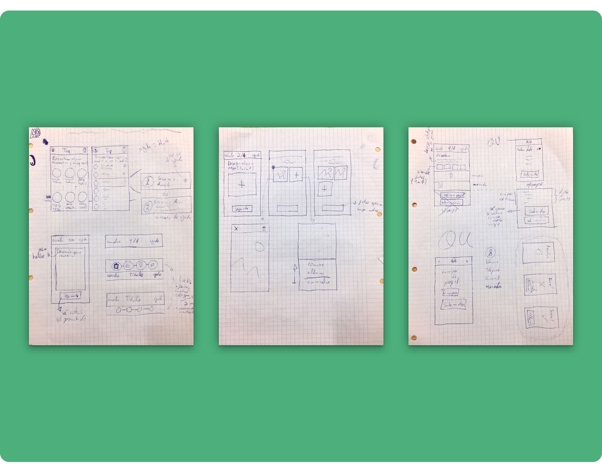
After identifying the key user flow and information architecture, we did some rough sketching and worked on low-fidelity wireframes to quickly generate ideas on how the main screens could fit together and figure out the details of the interface elements.
Applying lean UX, our team sketched wireframes to readily test, validate, and move on to digital wireframes.
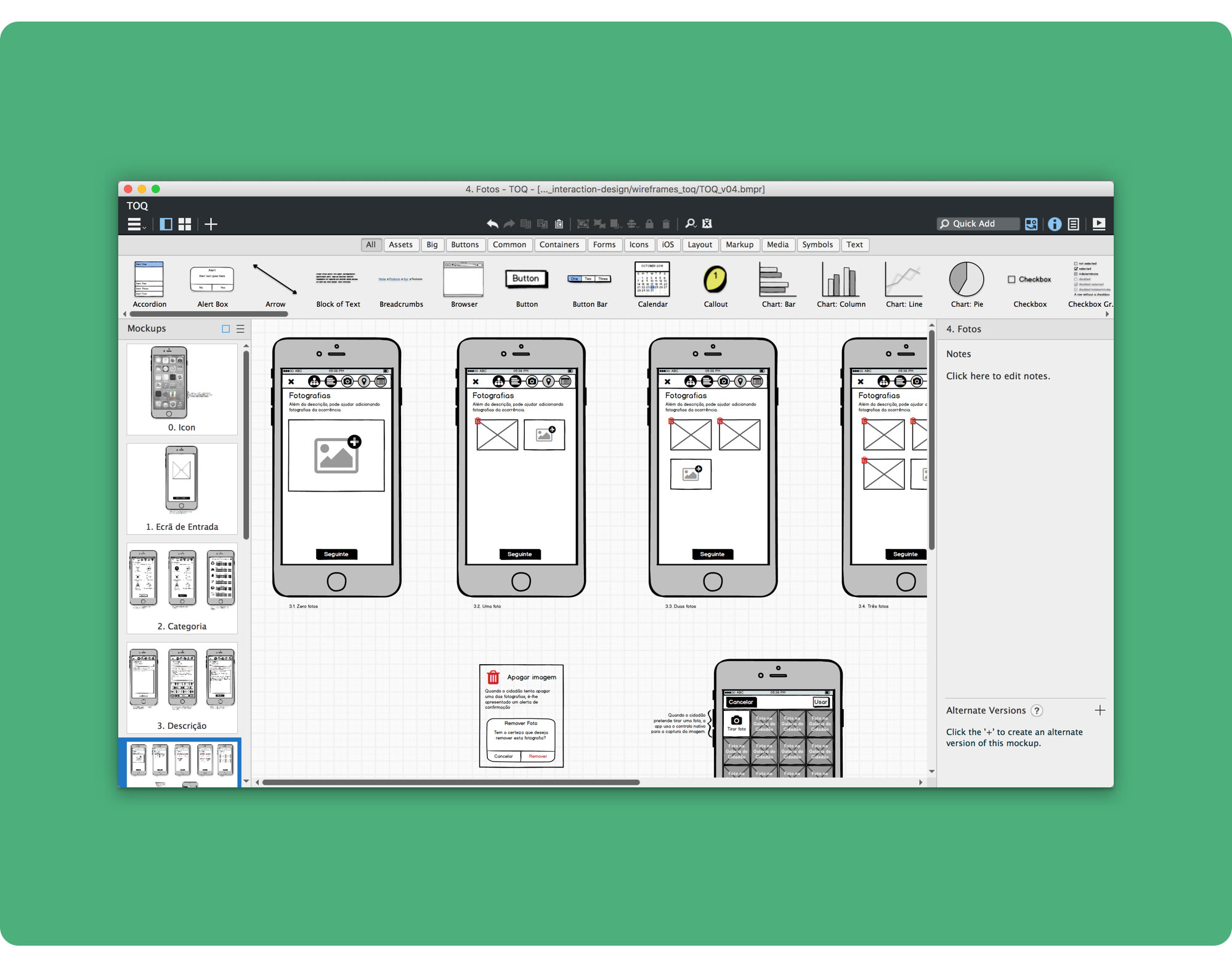
Each team member worked on their own wireframes using Balsamiq Mockups. We then revised every proposal and picked the best ideas and solutions that came up.
We settled on a linear navigation for the incident report, that progressively asks for the user’s input, in 4 easy steps:
- Pick a category;
- Describe the incident;
- Add a photo (optional; up to 4);
- Set the incident’s location (automatically filled-in by the device’s GPS but can be changed, as the user might want to submit an incident later);
- Revise and report;
All screens from the report user flow have a top bar showing the user’s progress and the number of steps until completion. The progress bar also serves as a navigation that enables the user to go back and fix any mistakes he might have done while filling-in the report’s details.
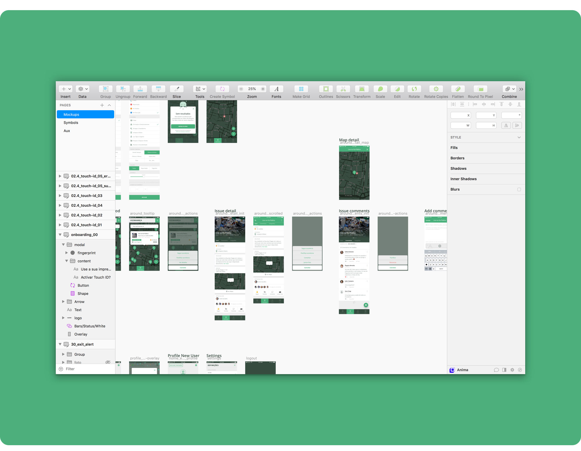
I designed high-fidelity mockups to establish the look and feel of our MVP and fine-tune all the visual details.
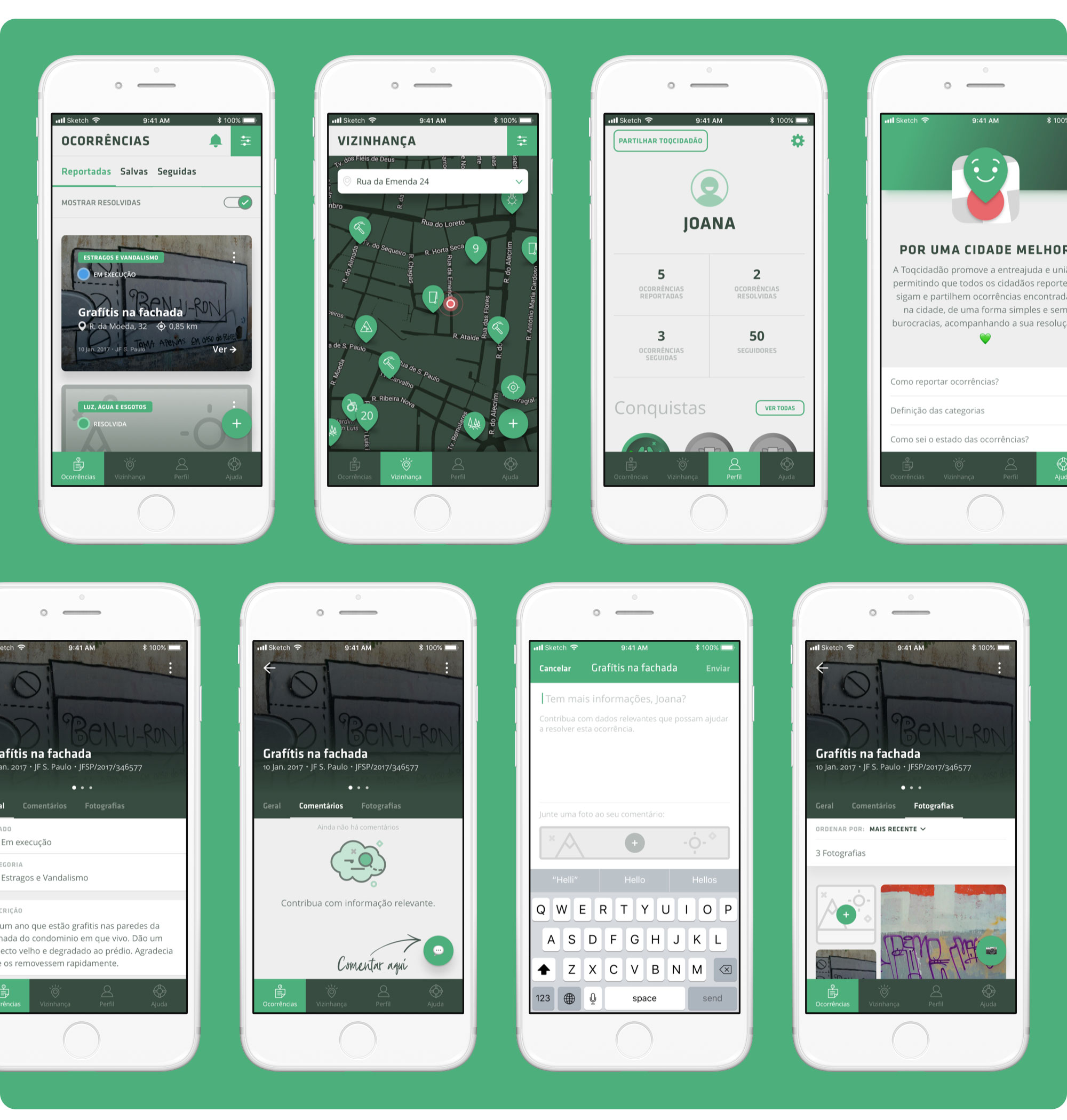 Toqcidadão’s main tabs — Home, Neighbourhood, Profile, Help — and Issue detail screens.
The reporting process is simple, straightforward, and can be finished in 4 easy steps plus confirmation.
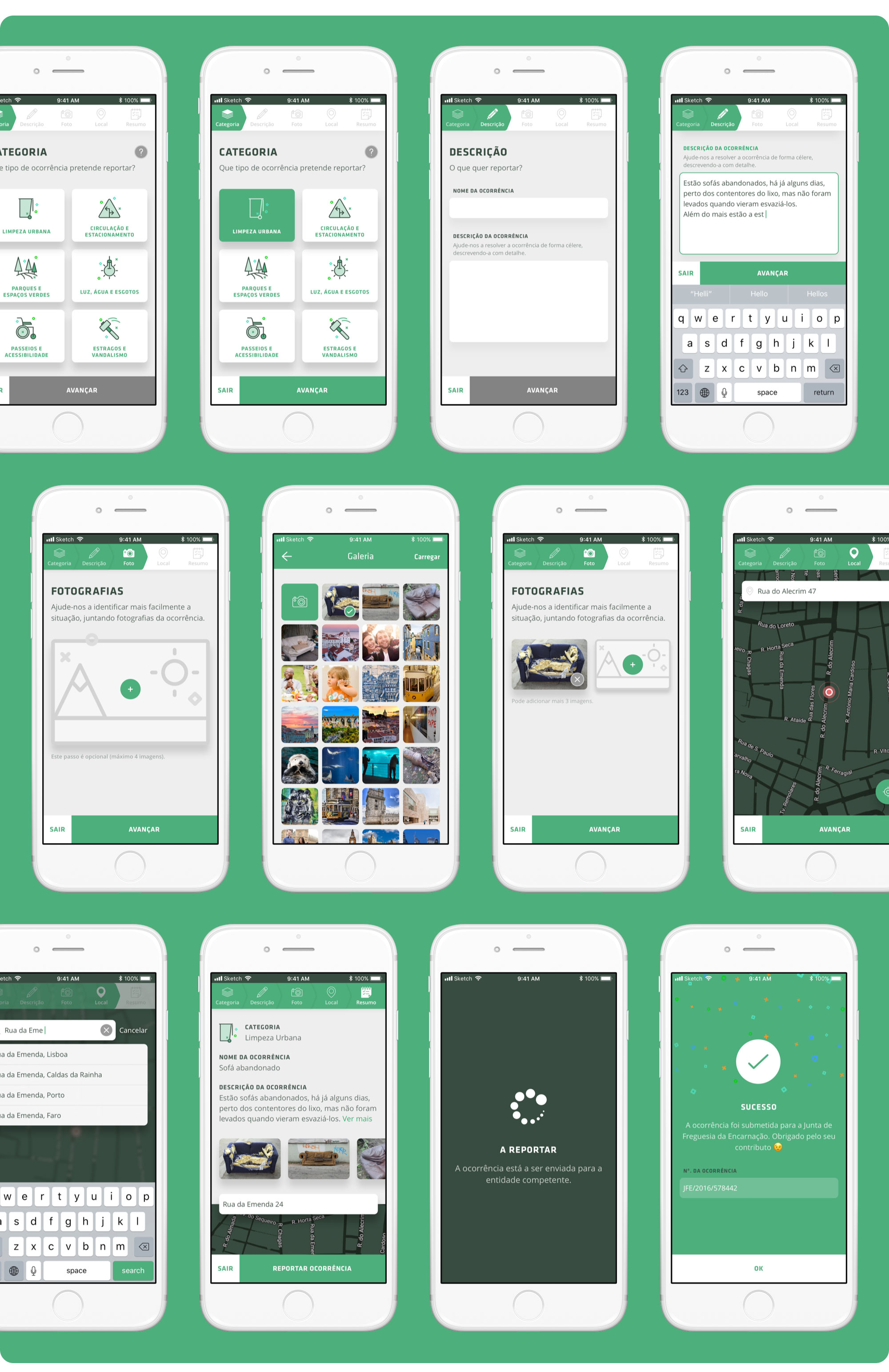 Toqcidadão’s screens for submitting an issue.
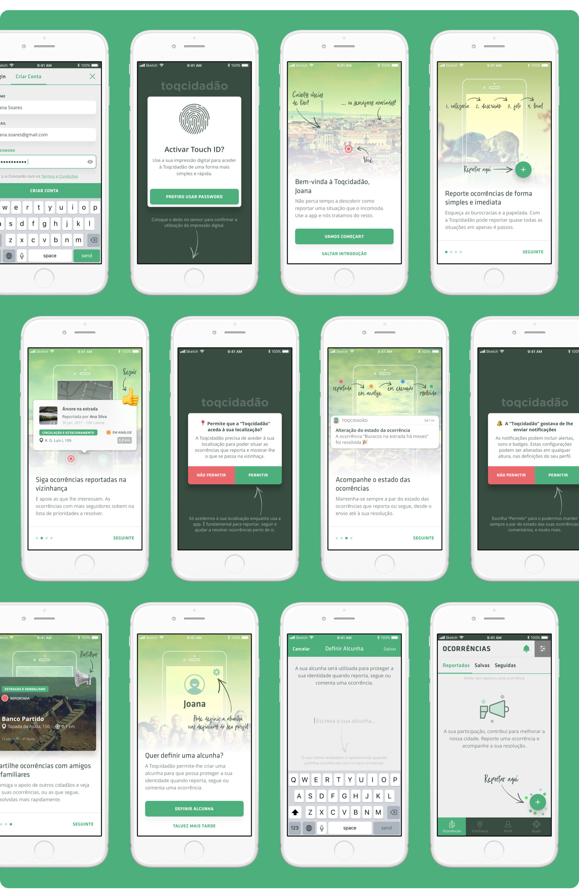
I also worked on a friendly onboarding that clearly explains the benefits of our product and shows how Toqcidadão can make our users’ lives easier.
Making sure they feel familiar with what to expect before using the app will hopefully ease our users into the product’s experience, setting them up for success, as well as reduce drop off rate and improve retention. 👍
I uploaded the mockups to InVision and made a clickable prototype to emulate the app’s behaviour and set up a basis to test the product (this links to our last prototype version, with improvements and fixes).
Keep it simple, so you’ll keep doing it.
Steve Krug, Don’t Make Me Think, Revisited
User testing was vital to getting feedback for our design solution and understanding if the app was clearly understood, working well and usable by our potential end users.
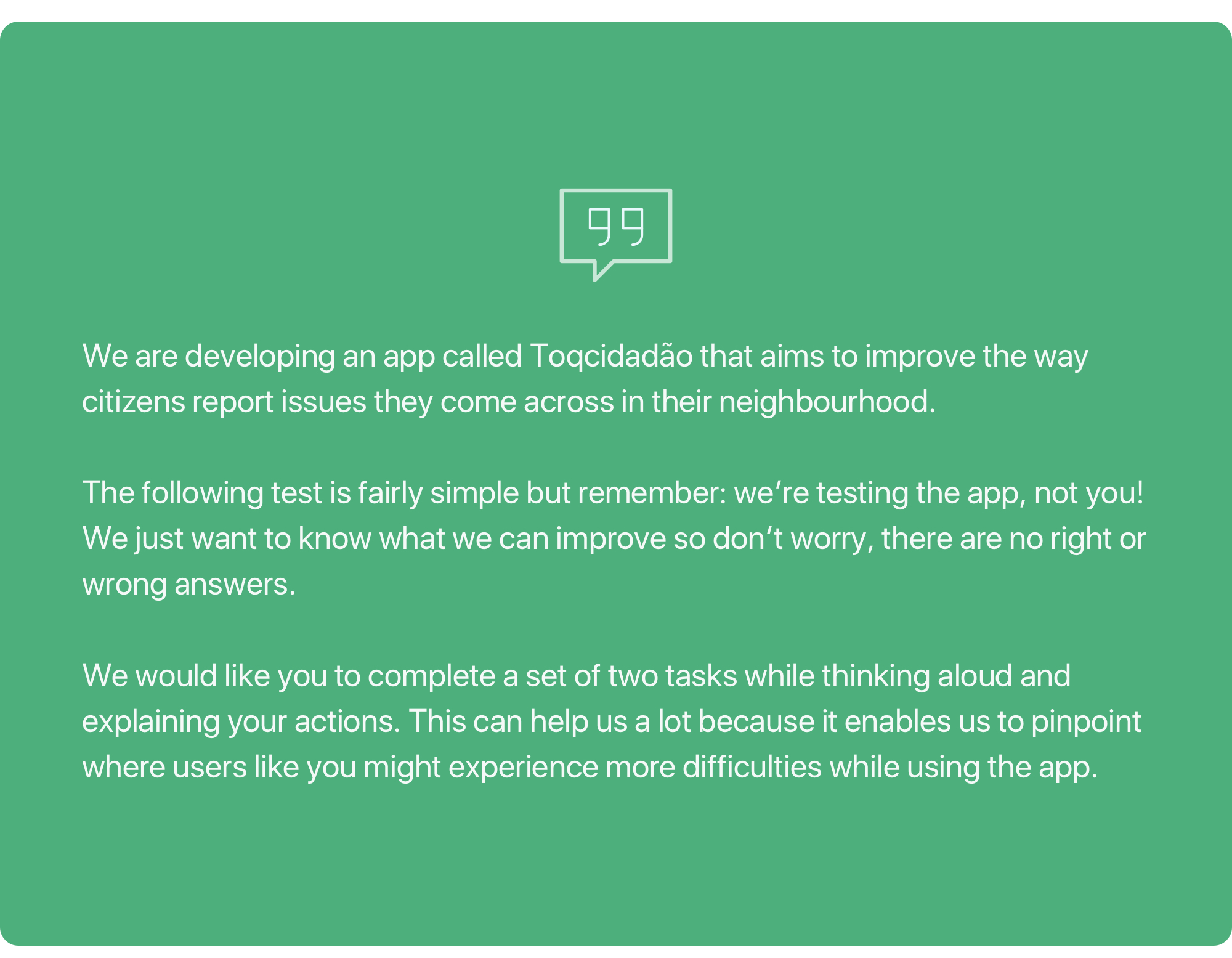 User testing intro to make sure our participants felt comfortable and relaxed.
We did multiple rounds of user testing, with a set of 2 scenarios, that allowed us to determine if our users could effectively perform the most routine task — reporting an issue:
1st Scenario:
You found an abandoned couch on the street. Using Toqcidadão’s app, report the issue to local authorities. Don’t forget to add a photo!
2nd Scenario:
You found an abandoned couch on the street, but you didn’t have the time to report the issue at the scene. You’re currently at home and want to report it. Using Toqcidadão’s app, report the issue to local authorities. Don’t forget to change the issue’s location!
We ran usability tests through direct interviews (≈ 10 minutes each) over 2 days, with a panel of 11 potential users, using the clickable prototype.
| # | Age | Gender | Kids | Education | Job |
|---|---|---|---|---|---|
| 1 | 61 | F | Yes | College | IT Specialist |
| 2 | 61 | M | Yes | College | IT Specialist |
| 3 | 48 | F | Yes | High School | Office Clerk |
| 4 | 25 | F | No | High School | Student |
| 5 | 52 | F | Yes | College | Senior Technician |
| 6 | 21 | M | No | High School | Student |
| 7 | 55 | M | Yes | College | High School Teacher |
| 8 | 44 | F | Yes | College | Events Manager |
| 9 | 43 | M | Yes | College | Mechanical Engineer |
| 10 | 27 | F | No | High School | Hotel Services |
| 11 | 40 | M | No | College | Software Engineer |
Demographic characterization of the participants. The sample was significant and adequately represented the potential users’ population.
We recorded all the interviews, following the express authorization of the interviewees (documented in the interview itself and on paper, before recordings began).
We took note of every issue, comment and relevant insight, and iterated on the draft product based on user feedback.
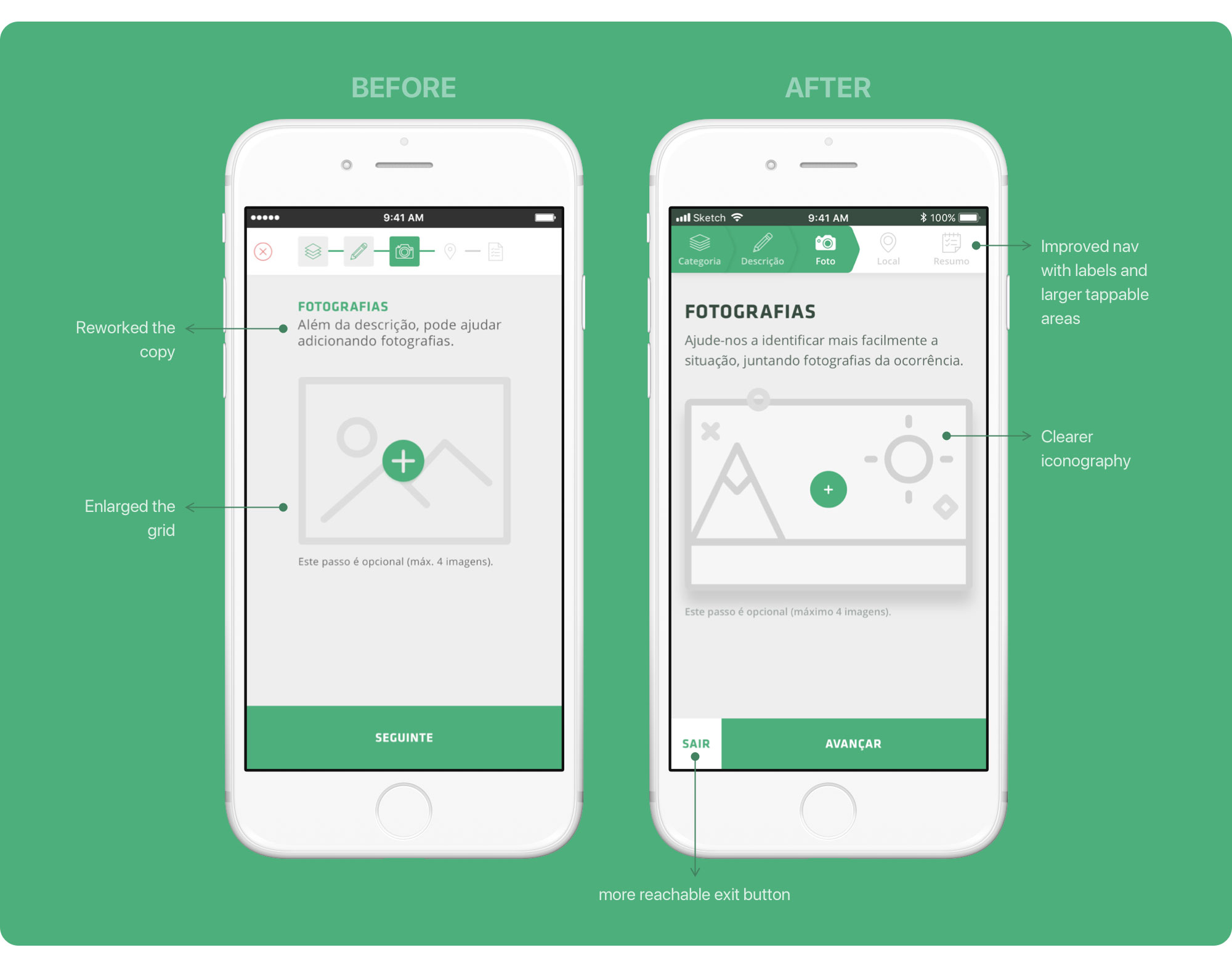 Before and after images of the top navigation/progress bar (report screens).
After each test, we always tried to collect more information on what people liked the most, what they disliked, whether the product had met their expectations and improvement recommendations.
Most participants weren’t familiar with this type of product (probably due to its very low existence and dissemination in Portugal) but overall, they thought the app was quite useful, clear and easy to use.
All participants successfully accomplished both scenarios with fair ease and speed, which shows the mvp’s good usability level.
During testing, our users pinpointed the following strengths:
- Very intuitive user interface;
- Fundamentally visual interface;
- Fluid, well-structured app;
- The user quickly reaches his final goal (report an issue);
- The app can improve the user’s life quality (no more queues and filling long forms);
- The app completely fulfils its intended purpose.
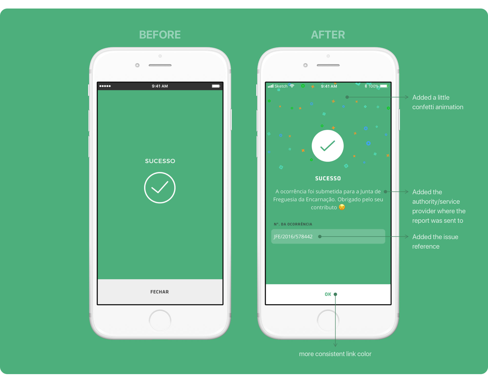 Success screen before and after images.
But the tests also helped us identify a few problems like:
- There is no way to know where the report was sent to; fixed
- There is no feedback on the outcome of the issue report; fixed
- Icons can be hard to perceive, especially in the navigation bar; improved the iconography and added labels
- The report summary was unclear for some participants; to be fixed
- Some users would like to receive an email confirmation when submitting an issue; to think about later
- Location editing is not intuitive; improved
- Too much text on the help screen; to be fixed
- More categories; to be fixed
- “People don’t like writing”. we’ll have to think about this one later on 🤔
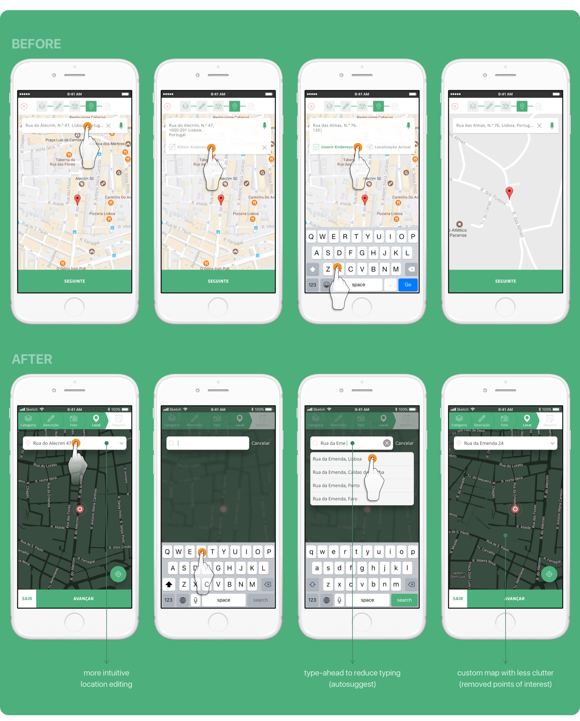 Change issue location before and after images.
Our users also left us with a set of relevant recommendations and suggestions to be taken into account in future releases:
- Extend categorization to areas of the private sphere (where public suppliers intervene, like “Utilities’ failures”);
- Improve the way monitoring the issues’ resolution is performed;
- Create a category explicitly related to animal protection;
- Create a category for non-typified issues;
- Create subcategories (like litter);
- Show the authority that receives the issue report on the Success screen — “Your report was submitted to authority x”. fixed in the MVP
👉 Check out Toqcidadão’s InVision final Prototype here — https://filipago.github.io/toqcidadao-app-prototype/
Overall, the tests went smoothly but naturally, the authorities’ response to the reported issues will decide the success of our product.
Part of the minor difficulties experienced by the participants during tests was due to some shortcomings in the initial prototype and not exactly user interface problems.
Implementing part of our users’ recommendations can bring significant value to our product, possibly with extra costs that may be marginal in terms of design and development.
Priority “fixes”:
- Rework the help screen copy and layout;
- Rework the report summary layout;
- Work on a more comprehensive categorization, like animal protection and noise;
- More in-depth testing of the categories with tree testing and card sorting.
Even though the following improvements don’t fully impact our mission, they align with our vision and would be nice to have:
- Voice-activated reporting;
- Make the product usable without a mandatory registry, even though some functionalities will still require it;
- Deliver local alerts like construction work, public transportation suppressions, strikes, venues’ closure, town meetings, etc..;
- Provide local council and service providers’ contacts and information;
- Connect with nearby council and service providers via social media;
- Provide local contacts for emergencies (like police and fire stations);
- Provide local useful contacts like pharmacies, train stations, etc…;
- Display nearby events.
👉 If you haven't seen the prototype yet, check it out here — https://filipago.github.io/toqcidadao-app-prototype/
Thanks for taking the time to read my case study.
A special thank you to the team, Juan de la Cruz, Marta Casal, Tiago Luís and Tiago Rodrigues.
