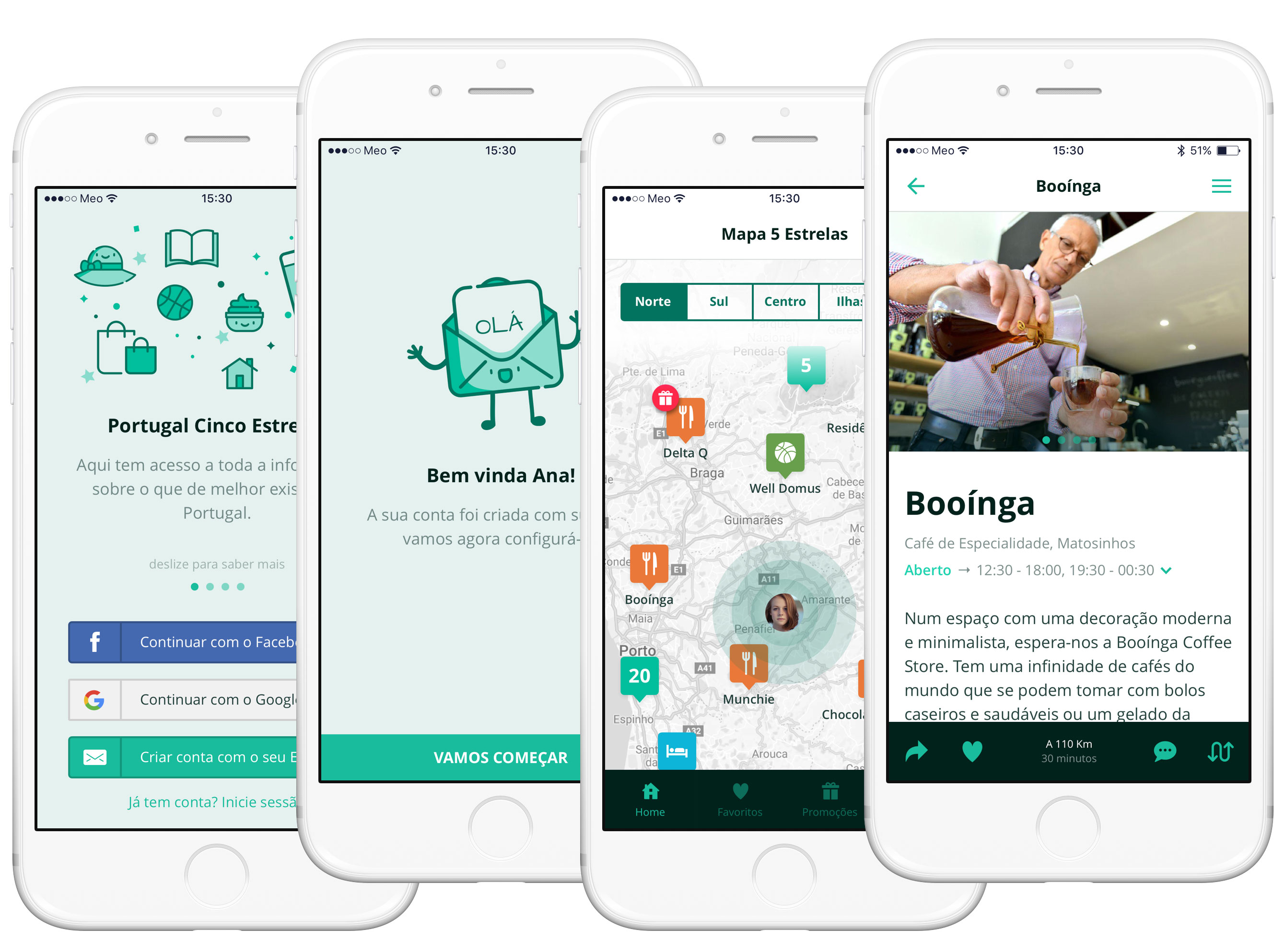
 Left to right: Entry Screen, Part of the Onboarding, Home and Product detail (Portugal Cinco Estrelas’ winner).
📖 Estimated reading time: 4 minutes (1013 words)
Table of Contents
- Summary
- Step 1 — Stakeholder Interviews
- Step 2 — Information Architecture
- Step 3 — Wireflows
- Step 4 — Style Guides
- Step 5 — Visual and User Interface Design
- Step 6 — Interactive Prototype
- Step 7 — Developer Handoff
- Next Steps
5 Estrelas (Five Stars) is a mobile app that lets users get to know Portugal Cinco Estrelas’ prize winners (Five Stars Portugal) per region and typology, as well as take advantage of exclusive discounts from several Cinco Estrelas’ brands.
Portugal Cinco Estrelas is a system that measures the consumers’ satisfaction regarding Portuguese products and services through 5 criteria that mirror the variables which influence the purchase decision — overall satisfaction evaluation, quality/price ratio, purchase intention, brand trust, innovation.
The 5 Estrelas app showcases the most relevant national icons in terms of natural resources, monuments, gastronomy and so on, elected through a survey by the Portuguese people and a strict expert evaluation. Thus, the app helps high-quality Portugal Cinco Estrelas’ winners reach a broader audience.
In this project, I handled the interaction design, user interface design (for iOS), prototyping, developer handoff and quality assessment.
👉 Check out 5 Estrelas’ InVision prototype here — https://filipago.github.io/portugal-5-estrelas/
The stakeholder interviews were the first step I took for gathering information about the product I would be working on. These were vital for understanding the clients’ goals and expectations and served as a starting point for further actions.
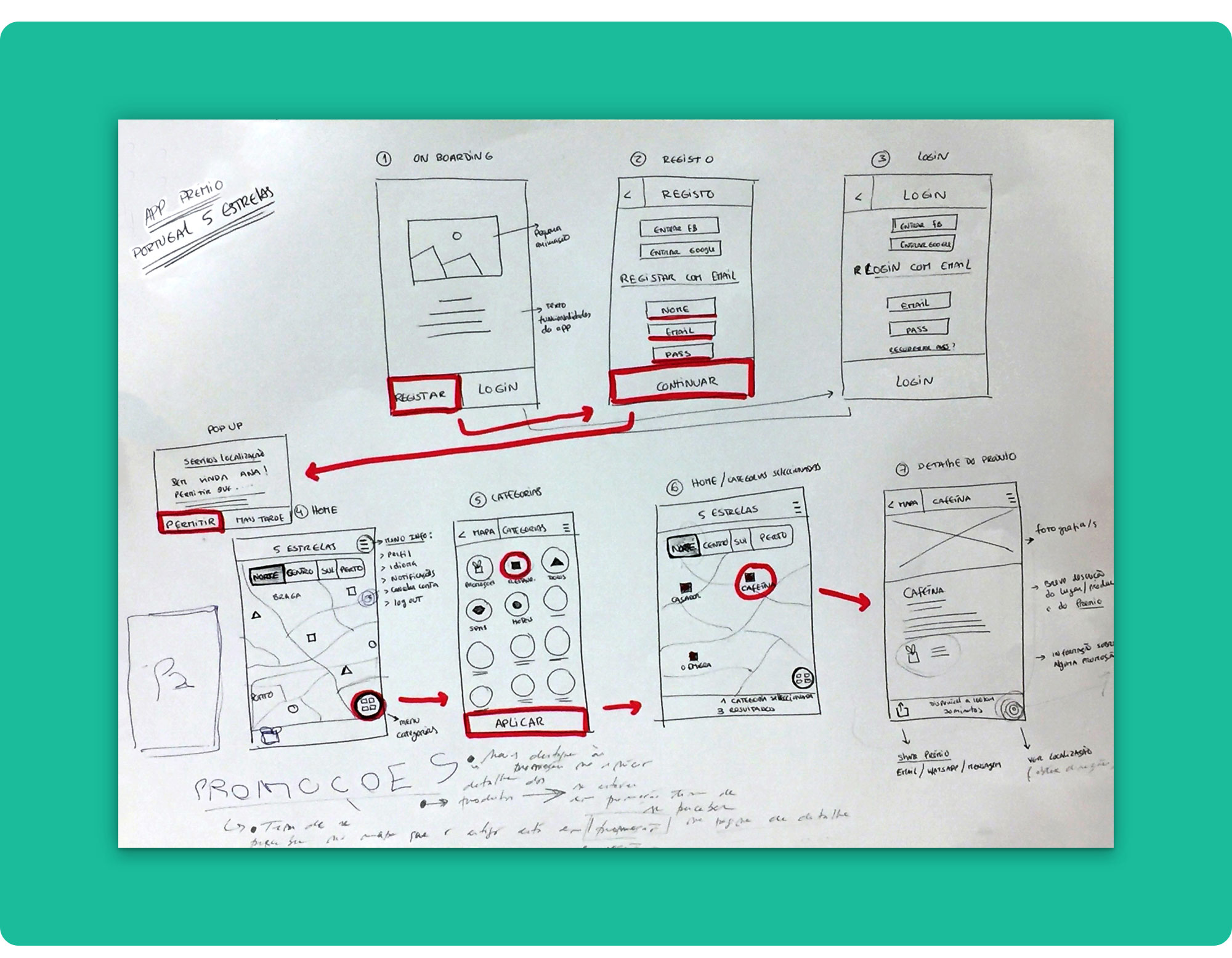
During these first talks, I used sketching as a starting point to outline the product’s design.
The initial sketches served as an early collaboration tool between the team and the stakeholders but also helped ensure that what would eventually be designed could actually be built.
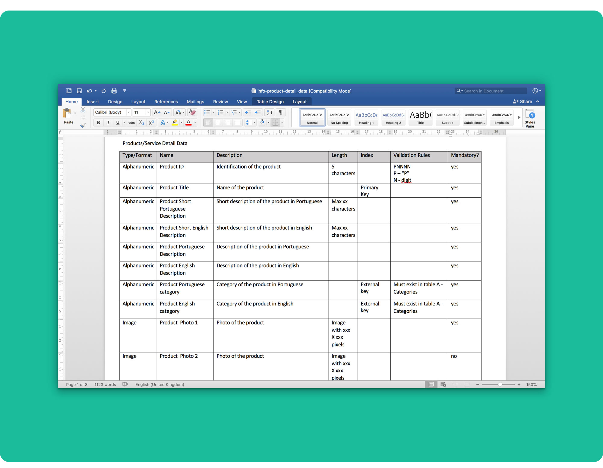
The stakeholder interviews also helped set up the data that could show up in the product detail screens (you can check the document here).
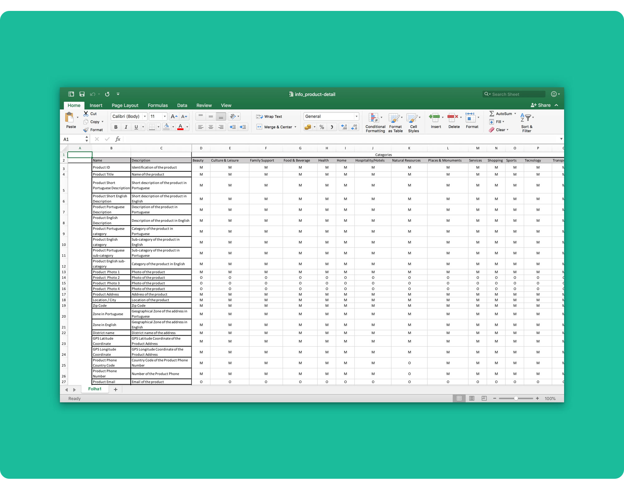 Product detail screens’ data by category.
From that list, we established which data should be presented for each type of product (by category). You can check the “templates” here.
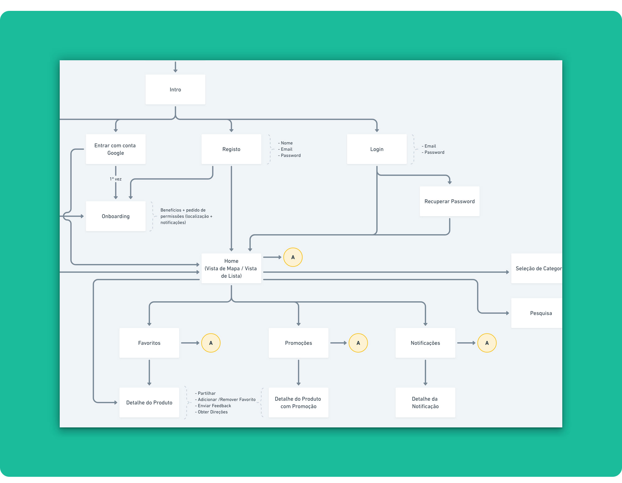 Information Architecture detail.
The insights gathered during the interviews were crucial for setting up the base information architecture that guided my work throughout this project.
Even though the product was fairly simple, visualising its whole structure early on was very important to clearly scope the MVP.
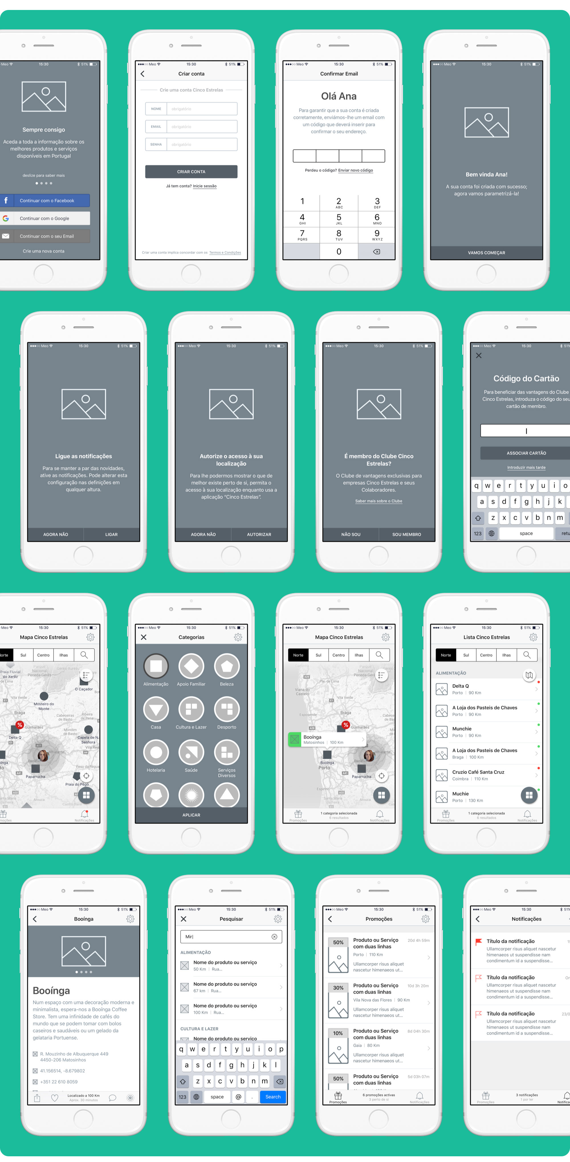 Part of the 5 Estrelas’ Wireflows.
I designed high-fidelity wireflows with real content to clearly show how the screens would flow and fit together in the final product.
This also helped stakeholders “see” the app before I got to the visual design stage, saving them a lot of time and money (time and budget constraints were tight for this project).
The high-fidelity wireframes let me work through many design details before getting into the visual design and helped stakeholders provide more constructive feedback during design reviews.
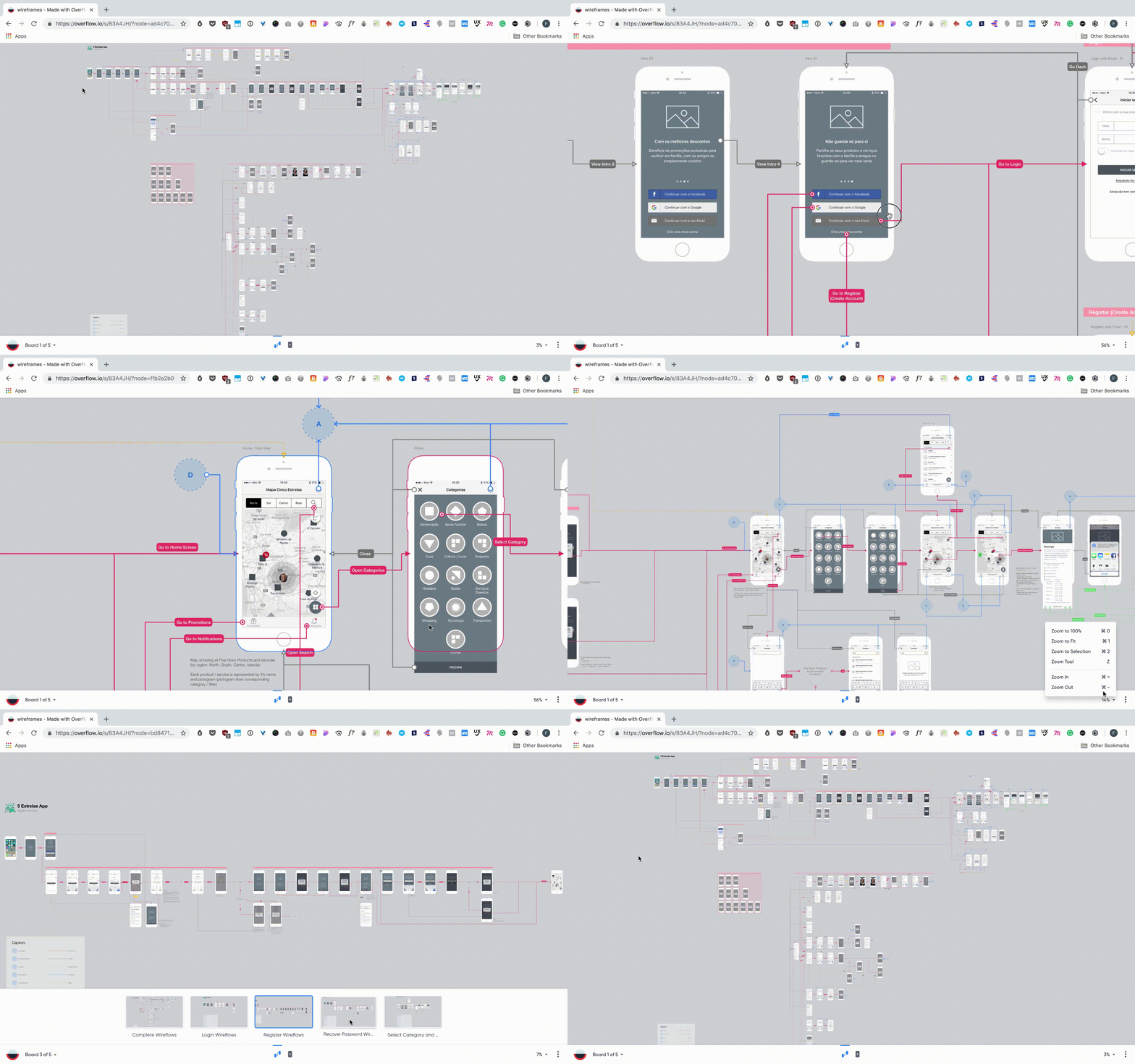 5 Estrelas’ wireflows in Overflow.
Overflow was my tool of choice to present the wireflows to the client in a more realistic and engaging way; almost like telling a story.
I worked with several boards to minimize the complexity of the diagrams: a complete user flow that illustrates all the product’s flows and smaller, more digestible diagrams, that refer to specific sub-flows and therefore are easier to read.
You can check all the wireflows here.
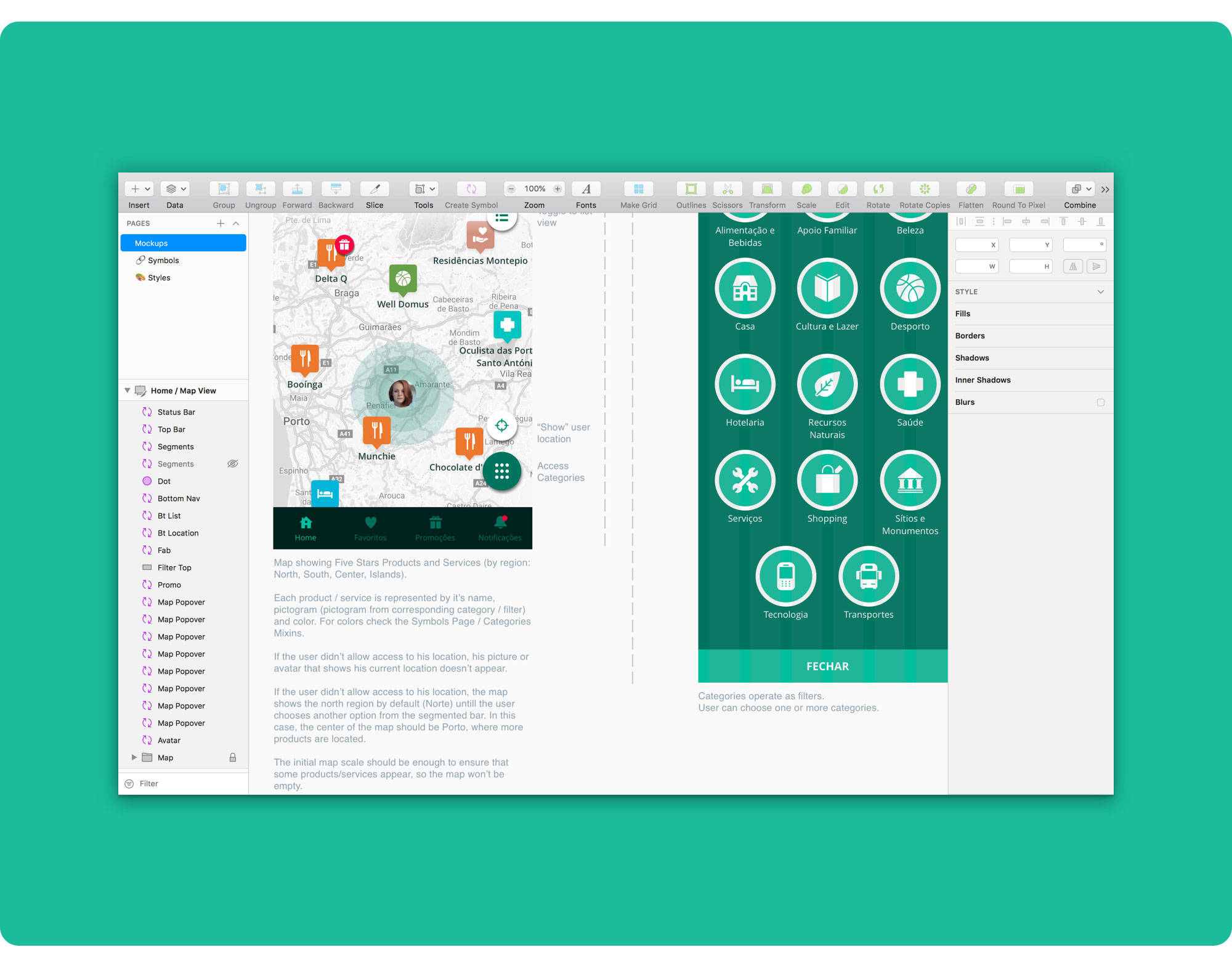
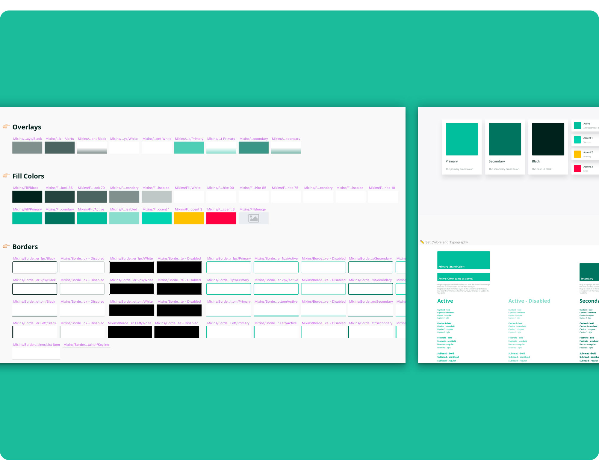 Just a small part of the style guides I worked on.
Before jumping into the mockups I designed style guides to make sure things were kept consistent throughout the design and development phases.
I used Sketch to build a large and flexible symbols library to guide the whole team. (🙏🏻 nested symbols…)
During mockups phase, I fine-tuned every element in the design and added a couple of things I noticed were missing in the wireflows.
The realistic high-fidelity mockups really helped stakeholders more easily see the final product in a way closer to the real thing and thus provide more valuable feedback for quick revisions.
Due to budget constraints, some parts of the wireflows ended up being excluded from the MVP, like adding a 5 Estrelas Club Card.
For the sake of organization, I was very careful when naming artboards and layers, trying to be descriptive and grouping elements together by common UI features. Not only because this would later help me build the prototype faster but above all because it would help developers analyse and understand the design more easily.
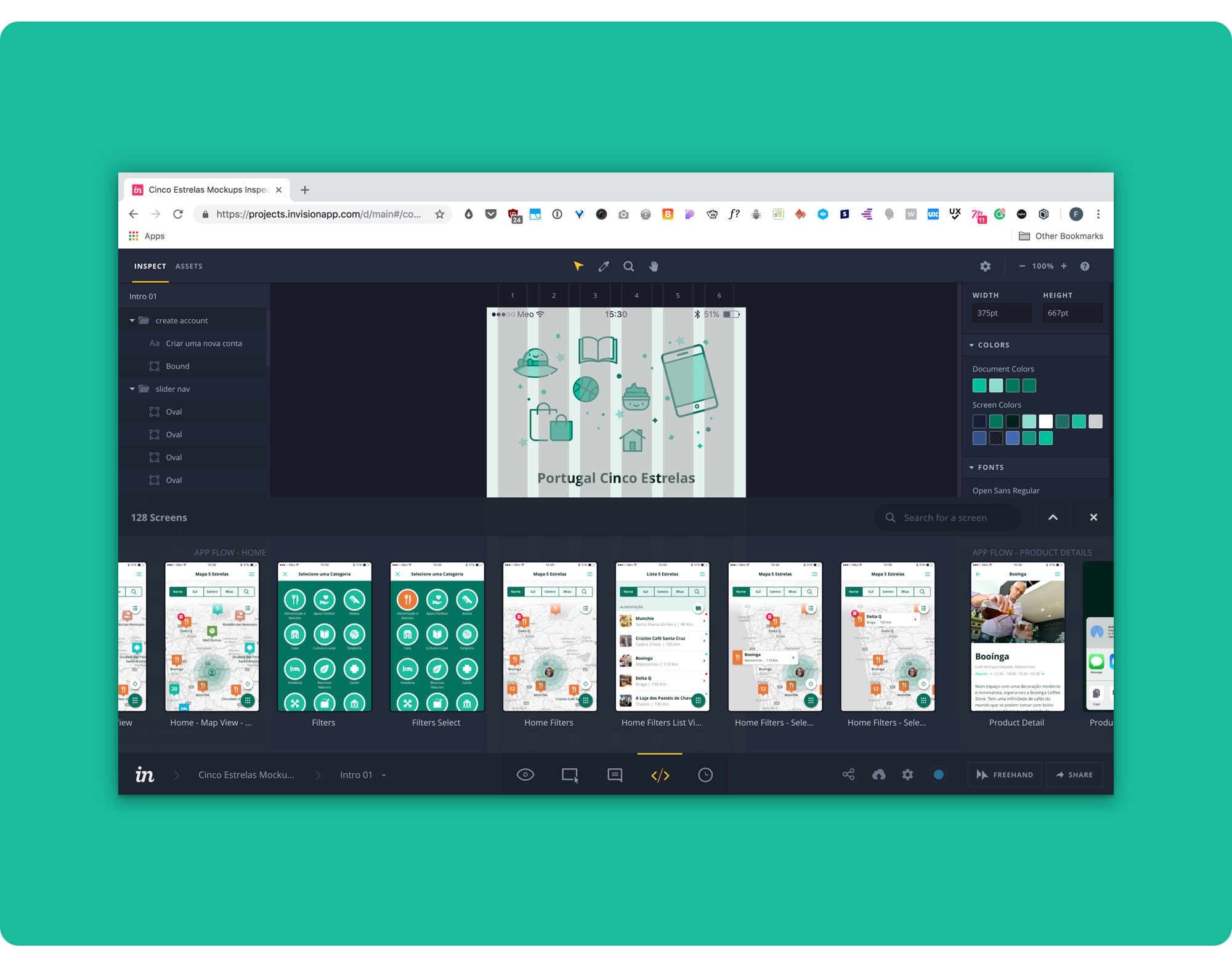
Prototyping was key to demonstrate the product’s behaviour and a great vehicle to communicate the UI design to the development team.
I chose InVision to build the prototype not only because it allowed me to quickly link the app’s screens together but also due to its “inspect mode” which is invaluable for development.
👉 Check out 5 Estrelas’ InVision prototype here — https://filipago.github.io/portugal-5-estrelas/
Before handing over the project to the development team I documented the whole design to assure a smooth delivery that minimized errors and misunderstandings to the max.
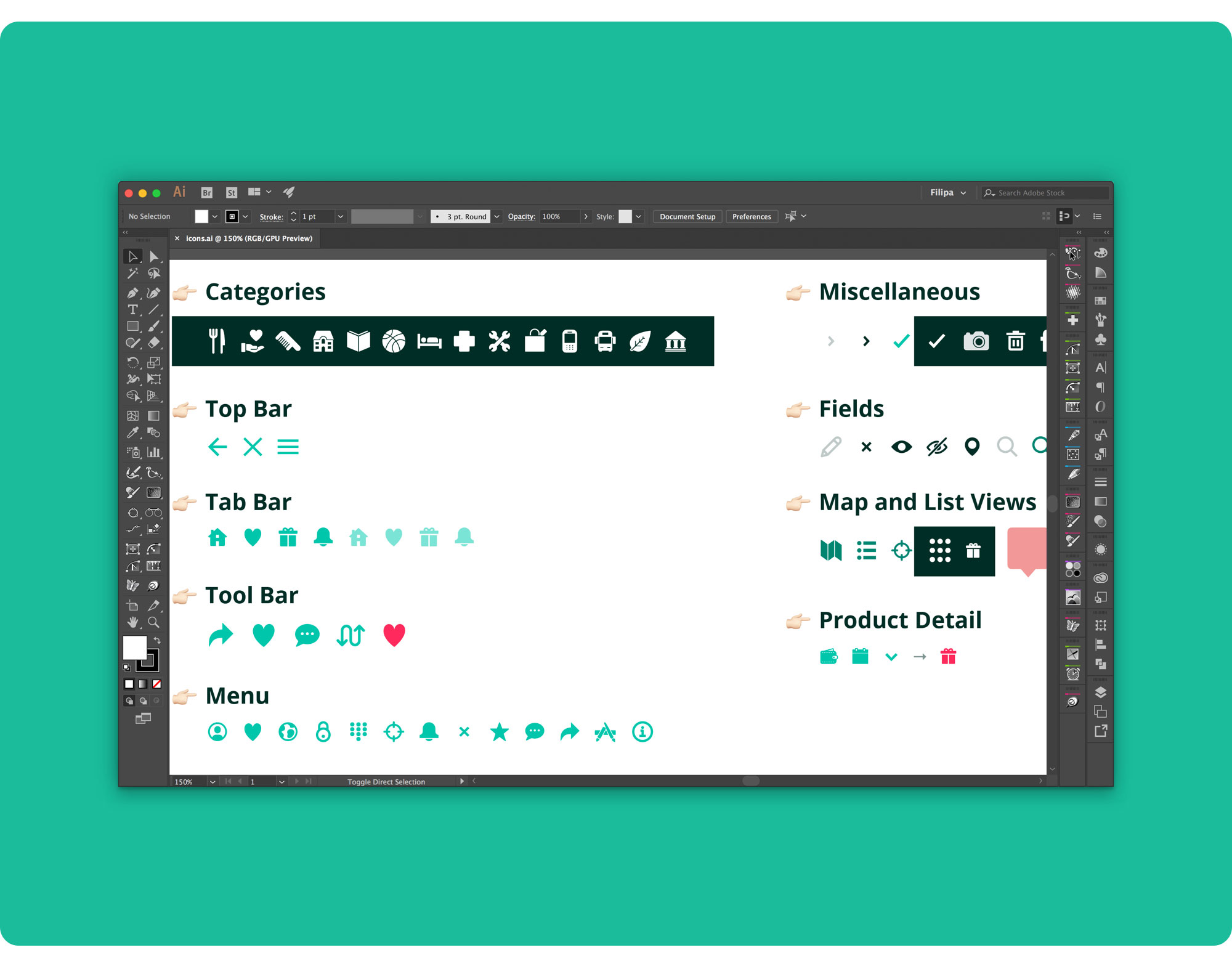
I exported the full range of assets and organized them in folders by type (illustrations, icons, photos) and element (categories, tab bar, toolbar, menu…), and prepared an Illustrator file with the whole set of assets to serve as a reference.
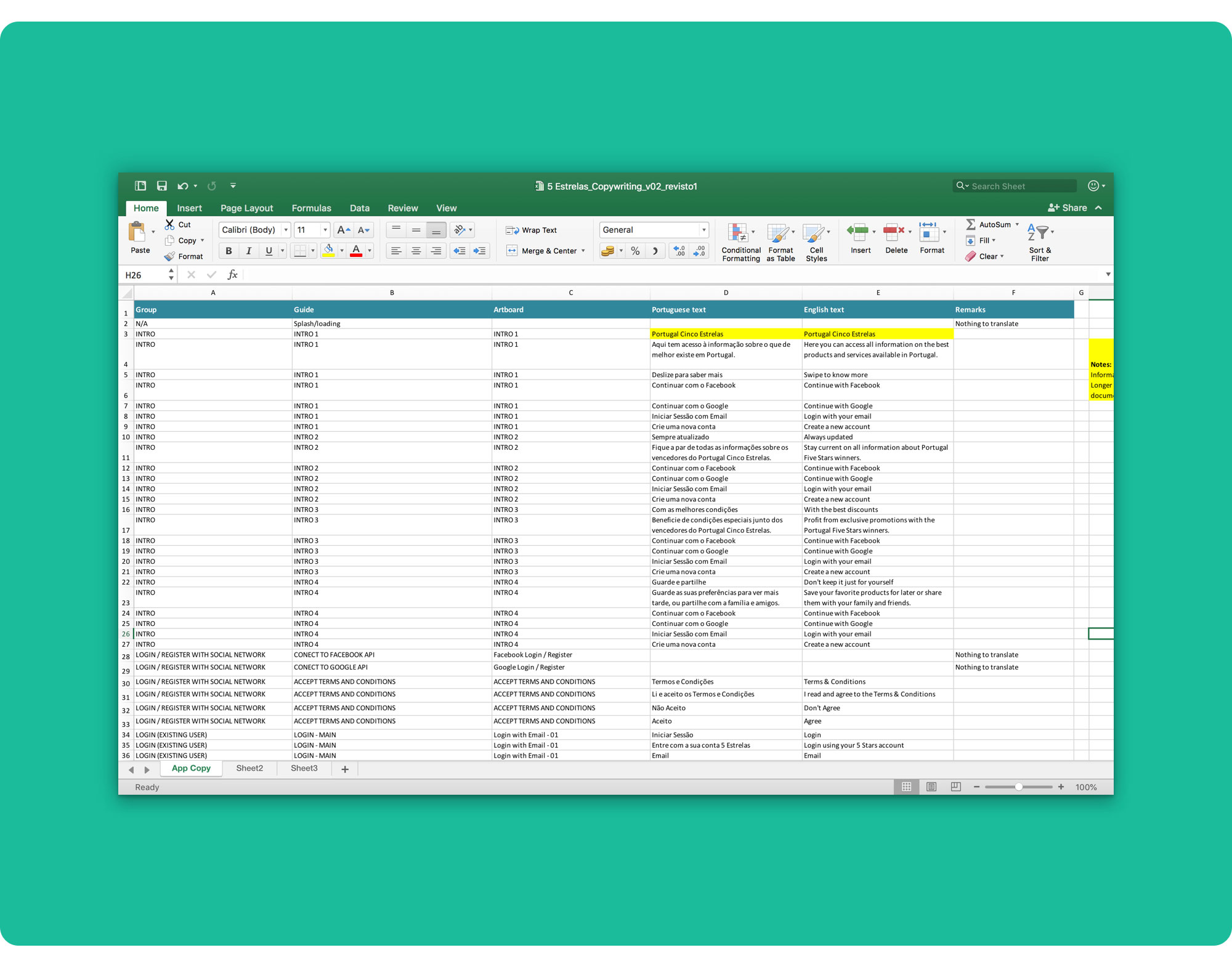
Finally, I prepared a table with the full copy, in Portuguese and English, organized by screen.
- Improve the search feature, such as:
- Search by product/service name;
- Search by category.
- Allow users to add their Cinco Estrelas Club member’s card;
- Allow users to rate products/services;
- Add a comment system;
- Provide suggestions based on the users’ favourite products/services (“If you liked this you may also like that”)
👋 Thanks for reading!
