-
Notifications
You must be signed in to change notification settings - Fork 10
Unintended outline present around tabs when using different color themes #3
Comments
|
Hi there, @Acumane! Can you kindly check if the problem mentioned exists with the vscode-libadwaita-colorscheme provided in the repository? I have a feeling that this issue is particular to piousdeer/vscode-adwaita#15. |
|
I will play around with piousdeer's colorscheme tonight, but the issue applies to any theme with outlines (the third image was taken with VSCode's "Dark High Contrast") |
Ah, I understand now. It seems I overlooked the possibility of using a different color theme. Personally, I prefer to stick with the current theme provided in the repository and only make adjustments to the color scheme, rather than changing the entire color theme, when I want to achieve a different visual appearance. Thank you for bringing this to my attention! |
|
Fixed with: 0f11f76 Note that I have not discovered a method to eliminate the background color from all tabs except for the active one. Interestingly, several themes employ a darker shade for the current tab and a lighter shade for the others, which contradicts the design principles of libadwaita and creates a somewhat awkward situation. |
|
Looks great!
It's actually standard for active Libadwaita tabs to be darker and I'm not sure how I feel about it: I'm not too bothered by slightly unfaithful themes; between Firefox, Obsidian, this theme, etc., complete consistency just isn't happening. To that end, I might look into adding a border around tabs for those higher contrast themes (so they're at least consistent w/ themselves). What do you think? |
😅
Absolutely! You're more than welcome to customize the theme according to your preferences. While I haven't provided detailed instructions for extensive customization, the theme is intentionally designed to be user-friendly and easily personalized. However, I will probably not accept pull requests for customization changes - each person has their own unique perspectives in this regard, so I believe it's best for users to tweak their local copies based on their specific needs - our main focus should be ensuring the correctness of the theme's behavior so that we can strive for consistency as much as possible in a way that is painless to customize and integrate with existing color themes |


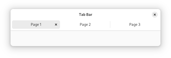
Adwaita theme:
Dark default theme:
Especially visible on higher contrast themes:

Specifically, the (1) shouldn't be there, and (2) should wrap around the tab in a consistent stroke width
The text was updated successfully, but these errors were encountered: