-
Notifications
You must be signed in to change notification settings - Fork 58
New issue
Have a question about this project? Sign up for a free GitHub account to open an issue and contact its maintainers and the community.
By clicking “Sign up for GitHub”, you agree to our terms of service and privacy statement. We’ll occasionally send you account related emails.
Already on GitHub? Sign in to your account
Icon contrast too low #43
Comments
|
Thanks for flagging, @ovanbiervliet. Just to clarify, which version of macOS is this on? Some of these are known bugs / quirks in SwiftUI, but the background colour menu icon is a new one. Also, do you have reduce transparency enabled in your accessibility settings? |
|
Oh, also @ovanbiervliet, did you change between dark and light mode at all? That can also cause some quirks. |
|
Big Sur 11.2.1, no accessibility settings enabled. Didn't change dark/light after installing. The cog fixed itself after I toggled the Hide Pika setting in the menu. |
|
Just did a quick test: from light to dark and back resulted in the cog being wrong again. |
|
Yeah @ovanbiervliet, it's a bug in SwiftUI, essentially. Unfortunately I have no control over the display of the icons or their colours, which is why I've used shadows. This seems to only occur in Big Sur. From my experiments, I found:
I'm still unsure how the background icon has a lower opacity there, as I can't recreate it. If you restart the app, is it still lower opacity? Ultimately I'm keen to see if newer versions of Big Sur resolve these issues, but until then, short of redesigning these components (which is on the roadmap, and I have an issue for that: #19) there's not a lot I can do. |
|
After restarting, the first time I see the Pika window the icons look fine. But as soon as I interact, even trying to take a window screenshot with CleanShot, makes the icons go wrong. Interacting with the individual icons afterwards restores the correct colors again. |
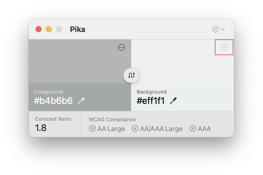
The contrast on the icons (settings, background color) is too low for accessibility reasons.
Also happens with lighter background color:

Edit: I saw this behaviour after first time usage. Now I get a dark cog for the settings, although the icon for background color remains nearly invisible.
The text was updated successfully, but these errors were encountered: