Project page: UI/UX Review #559
Labels
design/theming
discussion
project-page
Issues/discussions related to https://www.hotosm.org/projects/
From #557 - @katia-utochkina's review on Project page
Map has a long download time
The project map doesn’t come up quickly enough. It takes a lot of time to load. This degrades the user experience and slows down the entire process of working with the site.
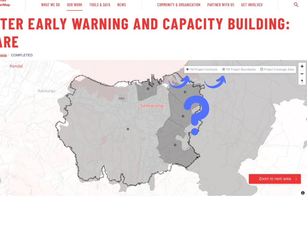
Project page missing page title & map missing a name
It’d be nice to immediately confirm what the page is once it’s loaded. Having a page title could confirm to the users right away that they’ve landed in the right place.
Also, it wouldn’t hurt to give the map a name conveying what the visualisation is about. Without it, the context gets lost.
Zoom-to-next-area animation happens too fast
On some project pages, animation is so fast moving, it's making me sick.
For example, while I’m ok with the animation duration here, https://www.hotosm.org/projects/disaster-early-warning-and-capacity-building-inaware
I feel dizzy here: https://www.hotosm.org/projects/modelling-exposure-through-earth-observation-meteor
The current 200ms used as the duration for the animation doesn’t give the best results and it needs to be tweaked.
Not all legend labels are easily understood
All legend labels should have names that are understandable. If that’s not the case, users can miss information they need.
For example, it’d be great to explain what TM stands for in “TM project centroids”, “TM project boundaries”. Not doing so can cause confusion because users, unless they are experienced ones, can’t accurately predict what the abbreviation means.

On screens less than 768px, touchable centroids are too small as well as too close together
On screens less than 768px, the centroids on the map are tappable. But they are too small and too close to each other to select precisely. It can take several tries to hit the correct symbol. Not being able to select the target corresponding to a particular centroid can be disconcerting for users.
(Also, I am already used to the look and feel of the map on the page. So I am not sure if centroids have sufficient cues to suggest clickability if the project map is viewed on desktop)
“Read the full project story” button intrudes on the experience of the page
On the one hand, the functionality is a nice touch. It gives users full control over whether they want to see the rest of the content or not.
On the other, cutting off a story with a button and making users tap it to continue browsing the page can be a good way to lose their interest.
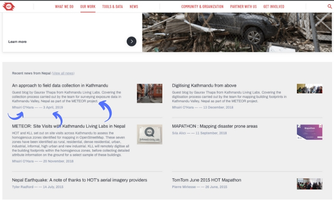
Too much information in the “News” section
The section featuring news items is overloaded with extra information. There is so much unnecessary text and metadata (timestamps, contributors’ names ,etc ), it’s overwhelming. If the aim is to create a clear and simple experience, this all needs to be removed, and a better balance of elements needs to be created.

The text was updated successfully, but these errors were encountered: