Expose is a presentation component Created by Dan storey.

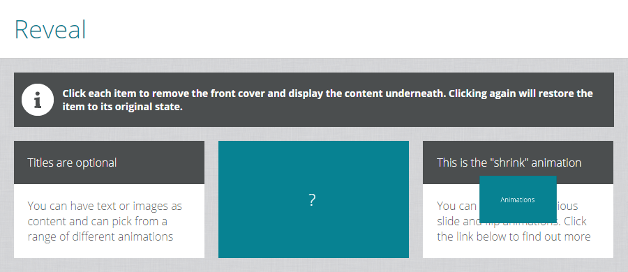
The Expose component displays panels of content hidden behind front covers. When clicked the cover animates to expose the content below. A range of different animations are available as listed below. When clicked again the cover is restored.
Click here for an interactive demo
##Installation
Run the following from the command line: adapt install adapt-expose
The attributes listed below are used in components.json to configure Expose, and are properly formatted as JSON in example.json.
For core model attributes see core model attributes. The attributes listed below are specific to the Expose component.
_component (string): This value must be: expose (one word).
_columns (string): The number of expose items on one line. Items display full width on smaller screen sizes.
_animationType (string): Possible built-in values are shrink, flipUp, flipLeft, slideUp, slideDown, slideLeft, slideRight. You may also assign your own value and use css to create your own animation. Documentation for this coming soon.
_equalHeights (boolean): Heights of each item are automatically resized to match the tallest one. Set this value to false to override this behaviour.
_items (array): Each item represents a panel of content and its cover.
front (string): The text for item's cover (default ?).
back (object): An image to be used for the expose item (optional).
title (string): The body text for the item (optional).
body (string): The body text for the item.
graphic (object): An image to be used for the expose item (optional).
src (string): path of the image relative to the src folder.
alt (string): This text becomes the image’s
altattribute.
No known limitations
Framework versions: >=3.0.0 Author / maintainer: Dan Storey